Cadson Demak is a Bangkok-based font foundry and communications design company founded by Pongthorn Hiranpruek, Burin Hemthat and Anuthin Wongsunkakon in 2002. Its name is a transliteration of Thai words that mean “very well selected,” and embodies the company’s philosophy of selecting the best solutions for clients.
Originally a graphic designer by trade, Anuthin began dabbling into type design as a hobby back in the ’90s at a time when the one-man type foundry was the reality, a tradition that persists today even with the rise of Thailand’s three large foundries that includes Cadson Demak. In addition to overseeing his company, he continues to write for publications and also teaches graphic design and typography at Bangkok University and Chulalongkorn University.
Nate spoke with Anuthin via email to understand more about Cadson Demak’s contribution to Thai typography and Thong Lor, its iconic typeface that helped to modernize the appearance of Thai in text.

Anuthin Wongsunkakon, one of the founders of Cadson Demak.
“A type designer’s job is to make new fonts. But why is it necessary to keep making new fonts? Don’t we already have enough fonts around?
To answer the questions, fonts may be likened to our clothes. The fact that people are always wanting new clothes is not because there are not enough garments around. While the basic function of clothes is to provide warmth and protection, or as an outer package for our bodies, we also need clothing to express mood, personality or character. We use it to show off our taste, status, trendiness or sense of fashion. And the more clothing items we have, the more able we are to achieve these purposes.
In much the same way, while fonts are basically packages for communicating ideas, they can also express mood, atmosphere and personality. Typefaces can evoke feelings such as friendliness, happiness, fun, or casualness, solemnity and so on.”
From Anuthin’s blog.

Taken from Cadson Demak’s interview with the creator of Thai Movie Posters. For many older poster designs, it was common to design only the letters that were needed instead of making a whole new typeface. Even today, the title or headline might have a unique style, but no suitable body text to match it, which could result in defaulting to a generic one. This is a constant challenge for many typefaces that don’t use a Latin script.
To understand why Cadson Demak’s Thong Lor typeface is so important, we have to understand a bit about how the Thai language works and where the evolution of it type design factors in. First, the Thai language.
The Thai written language has 44 consonants and 16 vowels (compared with English’s 21 consonants and 5 vowels). These consonants get their own character and their basic appearance is modified to mark vowels and diacritics to mark tones in order to write the different sounds.
This writing system is called an abugida and like the one used for Cambodian Khmer and other scripts common throughout Southeast Asia, it was adapted from the Brahmi script of ancient India.
For comparison:
- Logography: each written character (logogram or logograph) represents a whole word with all of its consonant and vowel sounds. Egyptian hieroglyphs fit in this category, as does Chinese, whose characters often include pieces of other characters to indicate sound and meaning.
For example, 青 (qing) means cyan on its own, but when combined with 水 (shui, water) which gets simplified to 氵, it becomes 清 (qing, clear).
- Alphabet: both consonant and vowel sounds get their own independent characters. English of course, uses an alphabet, but Korean hangul also has features of an alphabet.
For example, the ‘s’ sounds in 삼성 (samseong for Samsung) and the ‘l’ sounds in 꿀벌 (kkulbeol for honeybee) are distinguishable inside their respective blocks. Like English, the order for reading those ‘letters’ is left to right, top to bottom.
- Syllabary: consonants and vowels are bundled together into set syllables but don’t look remotely similar even if they share similar sounds. These syllables are combined to make words.
Examples would be Japanese’s hiragana script commonly used for Japanese words (しちみ for shichimi, the seven-spice mix) and katakana script common for foreign words (カナダ for kanada, Canada).
- Abugida: an abugida lies somewhere in between an alphabet and syllabary. For a normal Thai greeting such as สวัสดี ค่ะ sawadee-kha, the sa syllable appears underlined, but the vowel appears as a separate character but can’t appear without a base consonant.
If we took tried to represent it using the Latin script (albeit, very imperfectly) where the vowels were dependent on their consonants, it might appear as səmþiŋ intrestij laɪk ðis (something interesting like this). In Thai, these vowels and markers can appear in any position orbiting the consonant.
In short, like other languages that use an abugida, those accents and other marks are key to differentiating sounds and words, and thus meaning in Thai. And as with any written language, the way Thai appears differs depending on the context, whether it’s handwriting, in print or on screens.
Anatomy of Thai script, courtesy of Cadson Demak.
One of the big issues that remains at the core of the Thai language’s modernization in terms of type is the split between looped and loopless type designs.
What’s the difference? The loops that feature inside and at the ends of characters, and are often likened to the serifs of Latin typography (the embellishments on letters) both in a stylistic sense but also their dispensability.
Anuparp Dot. A retail font that uses loops. Anuparp means “power.”

A custom loopless font for Thai mobile network DTAC.
For instance, if you look at the characters representing the n and m sounds in Thai, which are respectively น and ม, you’ll see loops at various points in the character.
The loopless “sans-serif” versions of those characters see the loops becoming diminished and implied, resembling both a normal and backwards version of the English u. Naturally, Thai speakers can infer which letters are being used with or without embellishments like loops, similar to how you could still recognize a lowercase q in typefaces without the tail that hooks up.
Those That Came Before — and Those That Didn’t
But what makes this need for more and newer typefaces so particular in the context of Thai? The answer lies in its evolutionary timeline.
We could accurately trace the timeline of how the typography of other languages evolved through different stylistic specimens (kind of like a fossil record), but there was a noticeably large gap in the record for Thai’s typography, one whose impact is still felt today and would otherwise become greater as the importance of digitalization increases.
The Farang Ses typeface was designed in1913 and used by the Assumption College, one of Thailand’s oldest schools, to print textbooks. Its design is heavily influenced by old-style serif Latin typefaces and the demands of printing technologies at the time. Its ubiquity persists today into the digital age. The popularity of simplified sans-serif fonts in a Latin script
“They were using the same typeface on everything. The heavy need is there for a new typeface especially for international brands that would like to speak like a local without losing the sense of its global campaign.
On the other side of this story, the more brand fonts we put out there, the more need for a serious body text typeface. It is a situation that quietly followed like a shadow.”
— Anuthin Wongsunkakon, on innovation in Thai typefaces.
Cadson Demak is heavily involved in creating typefaces for brands to bridge global and local markets (such as for Samsung’s Galaxy Store), but it also instrumental in updating and adapting fonts for the digital age. By making web fonts available and open source through its work with Google Fonts, more people are able to access high quality typefaces for design and creativity.
Where Cadson Demak earned its initial reputation for trendsetting custom loopless fonts for business conglomerates in the first decade of operation, this led most font users to see the company as a proponent of loopless (also known as the ‘headless’) type styles.
This led Cadson Demak to adjust course. As with just about any form of design, once a style becomes trendy and embedded in the popular psyche, it quickly becomes overused and the flipside is other culturally or historically important styles fall to the wayside.
As with many typefaces that use non-latin script, the lack of diversity means that oftentimes, there’s a really unique custom font for the headline, but then the body text (which has to be especially legible) has to come from a smaller pool of generic choices. In short, your new hat is the best looking part of your outfit and represents you the best, but there’s no shirt or pants in existence, much less on the market, to complement it.
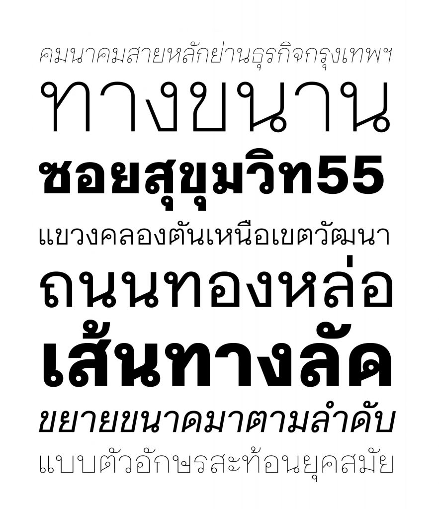
Thong Lor is not only named for the vibrant street in Bangkok’s northern Watthana district, but particularly for that street’s role as a shortcut between busy streets, which factored into the typeface’s design.
Molten Gold: The Missing Link
Filling this void and becoming a typographic timestamp for the language is Cadson Demak’s Thong Lor. Meaning “molten gold” and named after a road and neighbourhood in Watthana District in Bangkok, the area doesn’t just happen to be a hub of upscale lifestyle and entertainment or where Cadson Demak’s offices have called home for nearly two decades.
Functionally, Soi Sukhumvit 55 (the official name for Thong Lor) links major arteries and roads north and south of it, becoming a high-traffic shortcut for commuters. This notion of shortcuts is built into the typeface’s design and for that reason, the name stuck.
I ask Anuthin about the work involved in creating a new typeface.
“Thai is not a long haul task,” Anuthin says. “Although it’s listed as a complex script, it’s actually not a huge production. Creating a Thai typeface could take from a few weeks to a few months. It all depends on the complexity of the project and how big of the family.”
Anuthin’s track record for creating so many typefaces he’s lost count speaks to this tendency. In addition to creating several custom typefaces for Thailand-based clients, he also helped to create the Thai versions of Helvetica, Amplitude, Frutiger and Avanir, which thanks to their now unified bilingual appearance, led to their widespread adoption throughout the country.
That said, an undertaking like Thong Lor would take significantly longer.
Nearly a decade ago, a client requested a custom Thai font with loops with a minimalist construction and a contemporary vibe (in a scenario not too unlike Ming Romantic, the first typeface in this Type-of-Graphic series).

If a typeface’s design can accommodate more fonts and weights, the more expressive possibilities there are.
This of course, ran counter to the market’s preference for loopless designs as the conveyor of modernity. So with this exciting design challenge, Cadson Demak had type designer Ekaluck Phianphanawate, one of Anuthin’s frequent collaborators, get started on the initial glyphs, which are the graphical shapes representing the different Thai characters.
But as is the unfortunate reality of project work, the client changed their mind halfway through — and went with loopless, no less. So with that and combined with the resources needed to finish the typeface anyway, Thong Lor came to a halt.
Thong Lor fills a two-decade gap in the evolution of looped typefaces.
Three years later in 2013, Anuthin saw the time was right to revive the project and as an exercise in rekindling the industry’s interest in looped type designs. The work that followed would be one of the few modern typefaces to involve so many designers and specialists to realize its design goals.
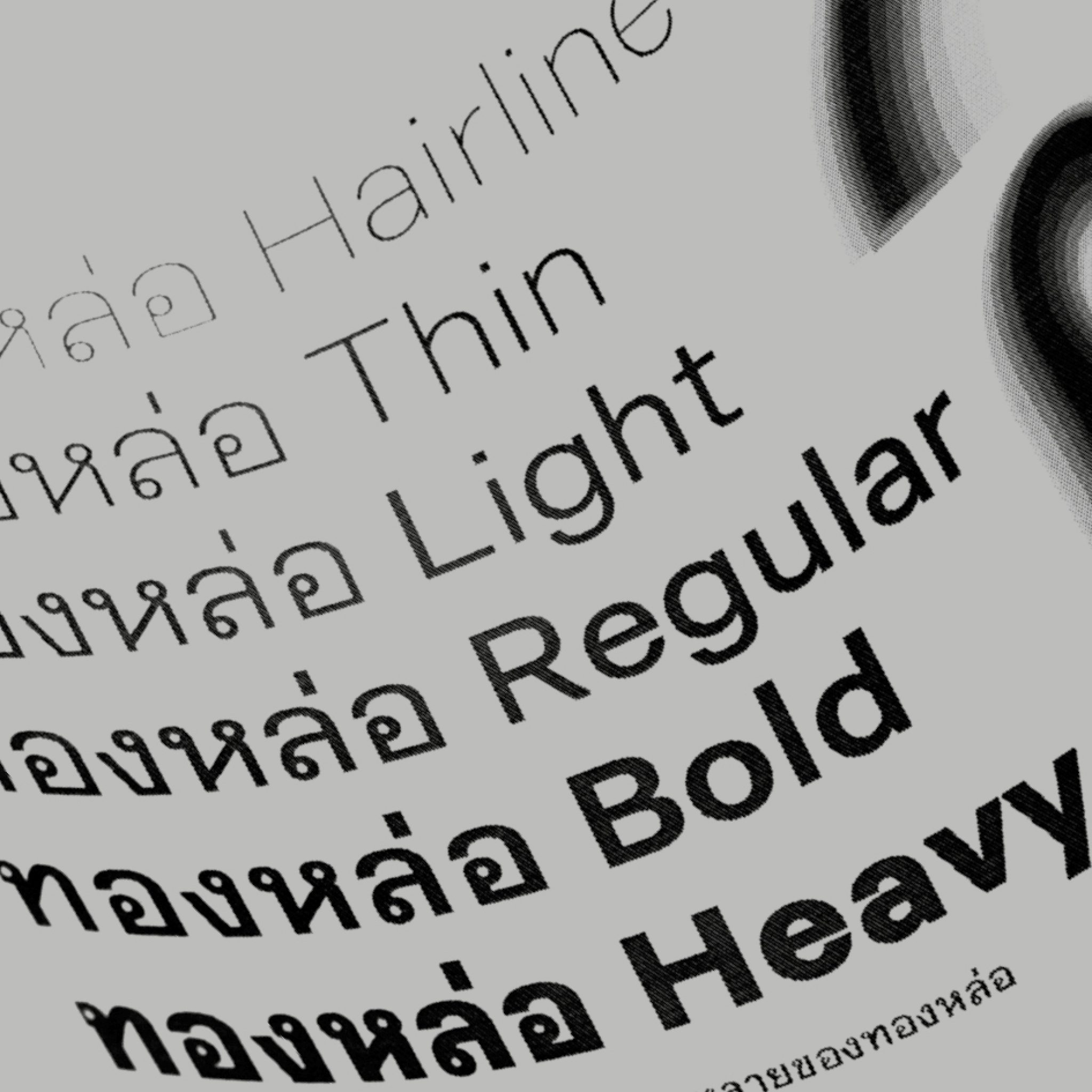
As it would become the typographical equivalent of a timestamp in Thai’s font record, Thong Lor’s design had to think big in many ways: it was designed to occupy more space per character in order to not just accommodate those vowel and tone markers crucial to Thai, but also the different thicknesses that range from a daintier Hairline all the way to the boldest Heavy.
The number of different font weights that could be cohesively included in one style makes Thong Lor also one of the few Thai typefaces that’s versatile enough to work as both a title and body font — and in together in the same work. By updating these loops, what might have otherwise been regarded as an “outdated motif,” Cadson Demak helped to revitalize interest in their usage and drive the type design industry in a new direction.
“Fonts may be likened to our clothes. The fact that people are always wanting new clothes is not because there are not enough garments around. While the basic function of clothes is to provide warmth and protection, or as an outer package for our bodies, we also need clothing to express mood, personality or character.
We use it to show off our taste, status, trendiness or sense of fashion. And the more clothing items we have, the more able we are to achieve these purposes.”
— Anuthin Wongsunkakon, co-founder of Cadson Demak.
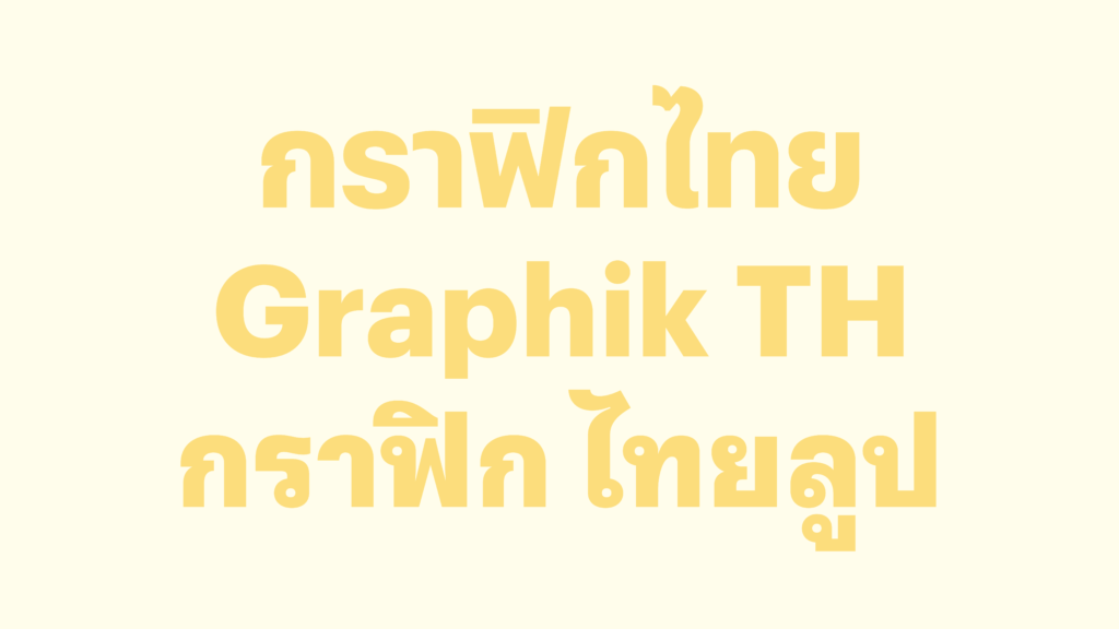
Graphik Thai was adapted from Christian Schwarz’ original Graphik typeface. Graphik Thai features both looped and loopless options.
The Road Ahead: Cadson Demak’s Next Steps
As 2020 comes to a close, Anuthin and Cadson Demak continue to lead the way in developing the type industry throughout Southeast Asia. Since 2010 (with the obvious exception of this year), Cadson Demak has hosted BITS, or the Bangkok International Typographic Symposium (BITS), together with the Typographic Association of Bangkok. I ask Anuthin what the next steps are for him and Cadson Demak.
Continuing its mission of bringing looped typefaces up to date, they recently released Graphik Thai this year, which was adapted from Christian Schwartz’s modern classic Graphik typeface, first released in 2009 for Commercial Type. A typeface Anuthin personally worked on, it features a whole 18 fonts each for both looped and loopless styles.
“We have a long list of to-do things including extending our flagship products to cover all the SE Asian scripts,” Anuthin says. Most recently, this has included adding the Lao and Khmer adaptations of its Sukhumvit typeface as part of its Sukhumvit CLMVT (Cambodia, Laos, Myanmar, Vietnam and Thailand) project. “We are also building a network of local type designers and foundries. The list goes on and on and we are having fun doing it.”
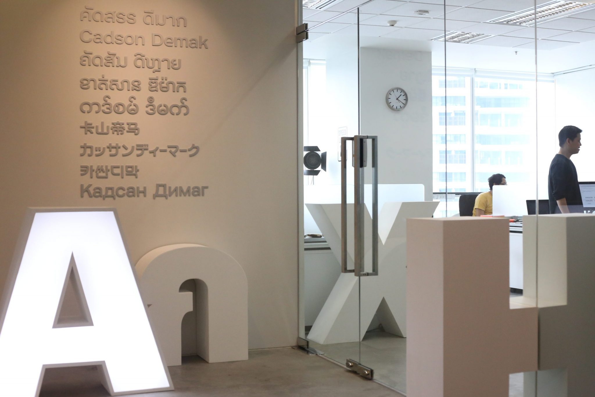
Cadson Demak’s office in Bangkok
Update: Making (Sound) Waves
Since the publication of this story, we’ve kept in touch with Anuthin and learned that in addition to partnerships with type foundries TypeTogether and Typotheque, Cadson Demak has refocused its efforts on its branding arm. “We’ve been localizing brand books for international brands entering Thai market such as Netflix,” he explains via email. “This also includes Thai typographic solutions so they can have the same brand aesthetic when using Thai to get their message across in all the media.”
Never limiting itself to exploring its strengths with visual media, Cadson Demak has taken this opportunity to explore other formats: a a gift to its supporters and clients, Cadson Demak produced an entirely original vinyl record, including the songs on it. “We have been working experimenting with sound projects in the background,” Anuthin says, adding that eventually, Cadson Demak hopes to add sonic branding to its repertoire of services.

Cadson Demak’s New Year 2022 gift to clients and supporters.


")


