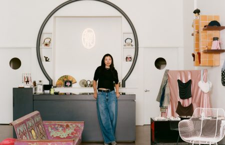
David Kenji Chang sat down with Eric Elms in his LA studio and new shop to talk about his life’s work and staying weird in a weird world.
A while back, the designer and artist Eric Elms was building out the new store for his brand Powers Supply when he was struck with a very clear vision for how to style, of all things, the ceilings: raw, exposed insulation panels. Specifically, one-inch Owens Corning Foamular 250 fiberglass boards, in a Pepto Bismol pink, with the Pink Panther logo. But they were hard to get his hands on, and when he did, they warped and wouldn’t lay flat. They also had the minor disadvantage of potentially burning down the entire store. “The fiberglass stuff was really flammable, so I was going to have to coat it with this non-flammable thing. So I just thought, why am I going through all this?” he says. “Why am I jumping through hoops just to use the original?”
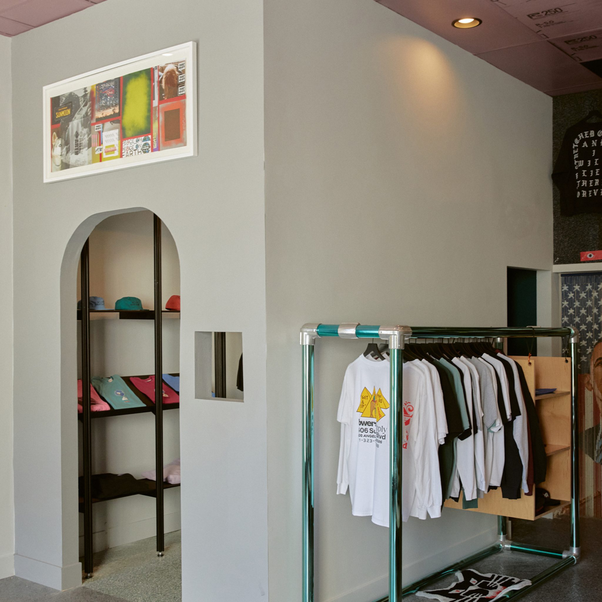
Elms pivoted, jumping through some fresh hoops of his own instead: he painted a set of plain white ceiling panels pink, and then screen printed them with the Owens Corning graphics, with one subtle change: he snuck the letters “PS” – Powers Supply – in stylized type, into the product code. All that to say: Elms had, in quintessential Powers fashion, logo-flipped the ceiling.
“I should have just done it from the beginning,” he says, sitting in a low slung recliner in the sun-drenched front window of the store and gesturing up at the ceiling. “It turned out better that way in the end.”
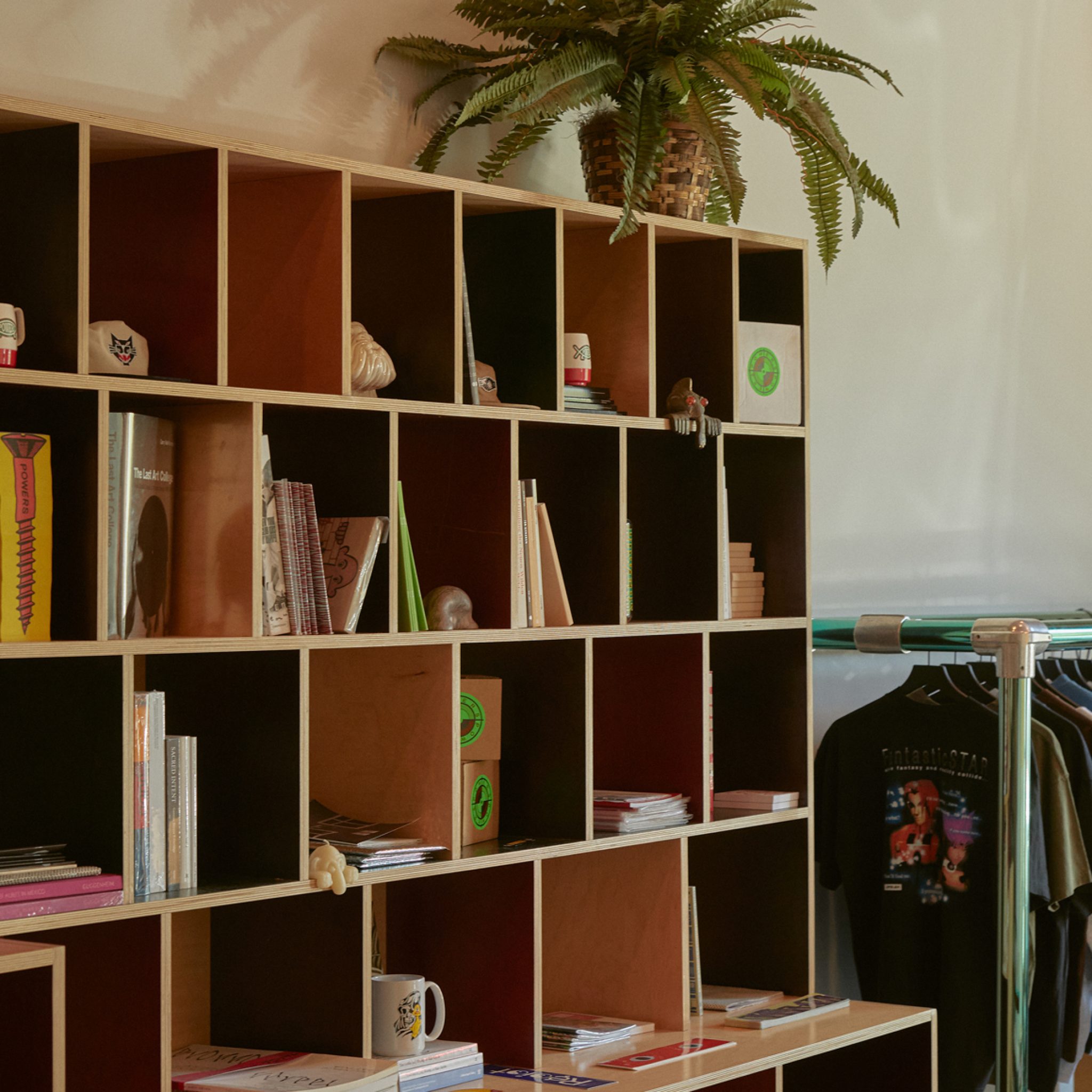
Creatively, Elms has always been a precocious, do-it-yourself type. He had spent much of the previous few months here, gutting and transforming a grungy, ramshackle appliance shop on the last bend of Sunset Boulevard, dialing in the details, making it truly a space of his own making. Other than the epoxy chip flooring, Elms did much of the work himself. Nearly all of the tidily conceived furniture and fixtures, like the color block shelving and the iridescent-green aluminum racks that look a bit like giant carabiners, were designed and built by him. He curated the decor. He painted. He did electrical work. He bolted strips of climbing webbing to the rafters, dangling from them to test their tensile strength before suspending inverted geometric Sony SS-83 speakers from them.
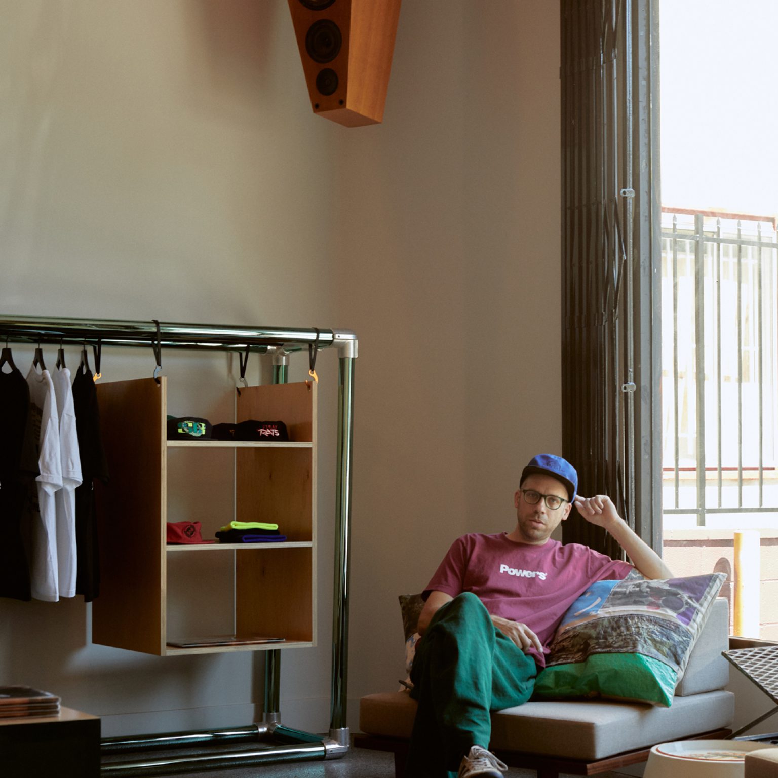
Powers Supply founder Eric Elms at the brand’s new store on Sunset Boulevard.
This shop replaces the original Powers store, which Elms only decided to shutter after imagining the potential of this new space. In a world where streetwear boutiques tend toward either spare, snobbish whitebox galleries or physically intimidating neon spaces that approximate shopping in the hangar of an alien spacecraft, the original Powers store, located on an odd stretch of LA’s Little Armenia, managed to be neither. It was esoteric yet not pretentious, thoroughly modern but also a throwback to simpler times, with a handmade, DIY feel. Like the best Powers designs – frequently some combination of brand logos flipped and repurposed, out-of-context deep cultural references and infographics, unnerving cartoon characters, bizarro phrases asserted in confident typefaces, and blink-and-you-miss-it details – it was pleasingly strange, vibrating with a peculiar energy, familiar in a way you maybe can’t quite place.
Elms, in many ways, took the spirit of that store and fully transplanted it here. The wall of playful, skateshop decor. The chilled-out atmosphere that makes you want to stay awhile. The whimsical collection of zines and art books and homeware. The curious way the merchandise selection can look scant at first glance but then seem to slowly expand with more detailed inspection. Soon, he’ll add a replica of the Powers Bench, a sidewalk art project that featured original works from friends Nick Sethi, Virgil Abloh, and Cali Thornhill Dewitt.
But this new shop, just a short walk from the Echo Park home Elms shares with his girlfriend Jackie and their dogs Buster and Penny, is a more malleable, versatile space. And it has some very basic comforts that its predecessor did not: a sound system; a small parking lot; an actual dressing room; air-conditioning. “The old store got so gross,” Elms laughs. “It got so hot.”
“It’s a million times better,” he said, scanning the room around him.
“Everything is better.”
Of course, this new store is also better for an altogether different reason: it can actually open. For most of the pandemic, the other Powers shop sat closed. Now, this new store presents a fresh opportunity to “reboot” and foray back out of hibernation: meet the brand’s supporters, hold events like book releases and product launches, and finally interact with the world again.
***
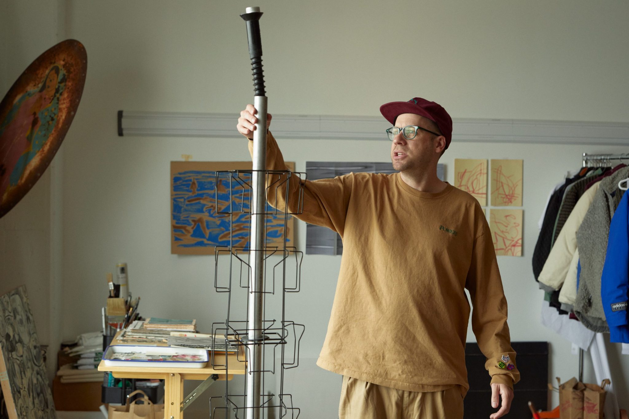
I had first met Elms in early summer, at his downtown LA studio in late Spring. He was in the midst of building a revolving zine rack for the new store, harvesting parts from two used magazine racks and combining them with a greeting card stand whose core he drilled out and outfitted with new ball bearings. “It took some jury-rigging, but it’s fun doing it. And I don’t want to put a shitty rack in the shop,” he said.
Just then, he pulled a large, black, plastic novelty screw out of the hole at the top of the rack. “Oh! This is the original screw,” he said excitedly. Screws have been a recurring motif for Powers from the beginning, and back in 2016, Elms had released an oddball item: beeswax candles shaped like foot-long screws. “This is what I used for that candle mold.”
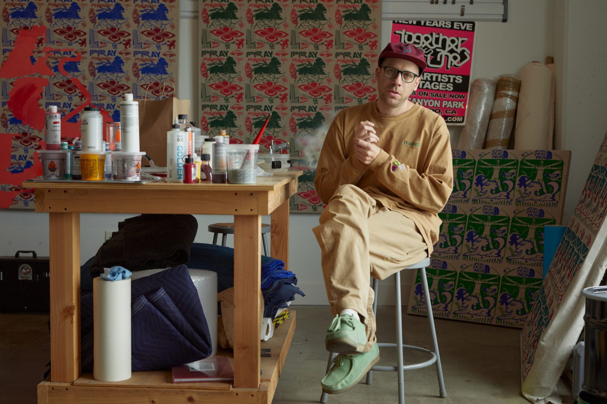
Elms’s studio, perched on the fourth floor of a gravelly industrial building, houses all of the busy arms of his creative output – Powers, his design agency Partners & Others, his art practice, his dormant publishing in-print AndPress. It is a small monument to the creative career Elms has constructed around himself. There are woodworking tools, bookmaking equipment, a heat press. Rolls of fabric and pieces of plywood. Work tables strewn with paint supplies. A rack of Powers samples. Prints from the book he made for Cali Thornhill Dewitt and the art zines he has published. A fixture shaped like a huge lightbulb that was the inspiration for the 3-D art installations he’s created for brands like Nike and Stussy. A shelving unit crammed full of art books and manga and zines. “I’m a big book collector; I have tons of books; there’s even more at home. It was the worst moving,” he said.
Ironically and serendipitously, Elms had moved his work here in February 2020 after working from his home garage for the previous two-and-a-half years. The next month his life inverted, but in reverse from most of the rest of society: for the span of the pandemic, with nowhere else in particular to go, Elms started commuting to the office, six days a week, every week.
The day I visited him, Elms brewed some coffee and recounted a story he likes to tell about a Powers design: in the fall of 2019, he went to the Hauser and Wirth gallery in downtown LA to attend an exhibition of work by Philip Guston, including his series of parodic Richard Nixon illustrations from the 1970s. Elms learned they had been inspired by a 1971 summer meeting with firebrand author Philip Roth and his polemic novel Our Gang, a crippling takedown of the hypocrisy of the Nixon administration. Elms became curious if that book’s cover – a simple arranging of title and author in a slightly serpentine serif font – was the work of Paul Bacon, the designer behind other iconic Roth covers, like Portnoy’s Complaint. After poking around and confirming his suspicions, he decided to use Bacon’s rendering of Our Gang – “a cool little saying” in a distinctive little font – as a logo lockup for a hat and t-shirt, with “Powers,” in san-serif block letters, in place of Roth’s name.
“People probably barely get the reference,” he said. “And that’s why I make it, because almost nobody gets it, but maybe a weird designer gets this part of it.”
Elms told me this for two reasons. First, because this is the apotheosis of his creative experience: a random encounter in the world – a painting at a museum, an offbeat combination of words overheard at a bar, a Japanese character at an izakaya in Tokyo that catches his eye and just happens to be read as “P” – that sends him tripping down a “K-hole,” chasing an obscure reference to a reference, chopped and screwed until he lands at an image with a particular visual valence, a certain pleasingly inchoate energy, that feels right.
And second, because, well, experiences like these had vanished from the Earth for much of the last year and a half. “There’s no openings, you can’t go to any museums. I mean, you can have a conversation with a stranger you’ve kind of known for five minutes and you’re like giddy,” he said with a laugh. “I think, near the end of it, you start realizing, ‘Oh, I’m missing out on that slice of life,’ you know? That slice of inspiration.”


In his studio, he sat down and imagined all of the projects he finally had the time and space to finish and then promptly spent hours not doing any of them. “I’d think I have all this free time to do all these projects because the agency work was dead. But then, you’re just not in the mind space, you know? So it was basically just coming here, spinning the wheels. I didn’t do shit for six months even though I had a lot of time, you know?”
Slowly, he got unstuck. Powers continued regularly dropping products. He toyed with a chain stitch machine. Inspired by a friend in a studio above him, he bought a rowing machine to sweat out the stasis. “I was getting creaky,” he said, “like an old man.”
He worked on experimental art projects. Elms showed me a series of fantastical graphics – a crown-adorned lion with six legs, marching beneath the word “PRAY,” a cartoon character guffawing next to the mid-90s Xerox logo, an animal hieroglyphic superimposed on The Vetruvian Man – that he had repeatedly heat transferred, in two-tone color, onto a linen canvas. He then pointed out where, imperceptibly, it hadn’t gone quite right. “When I messed that up, I was – sometimes you just get sick to the stomach when you fuck something up. Just oof,” he said. “Sometimes I have the feeling in my head, but then you do it, and it’s just not right. I’ve had it where I think, ‘I feel nauseous; I’m going to go home – just go home and sleep on the couch.’”
After devoting endless hours combing through thousands of images, including a nearly comprehensive sampling of t-shirt graphics he has made – for Powers, but also for Supreme, Stussy, Carhartt, and Nike, among others – he launched a new website for Partners & Others cataloguing his career’s work. He hopes it will help the world have a clearer understanding of the true balance of his output. “People are always asking, ‘Do you do other stuff other than Powers?’ And it’s like, ‘Uh, yeah, that’s all I do,’” he said sarcastically. “How do you think I make money? I guess I need to post about this other stuff more, because no one knows I’m doing it.”
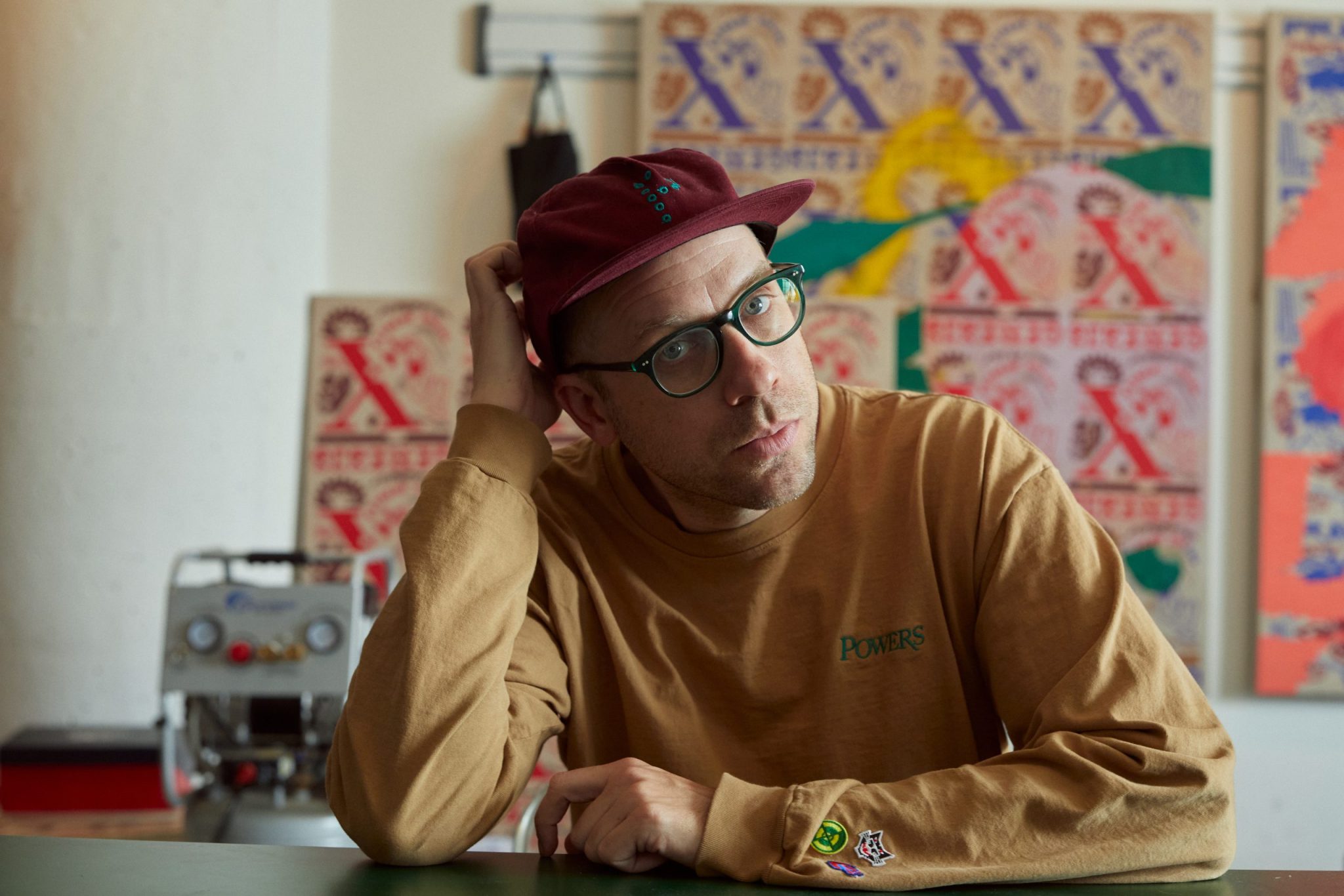
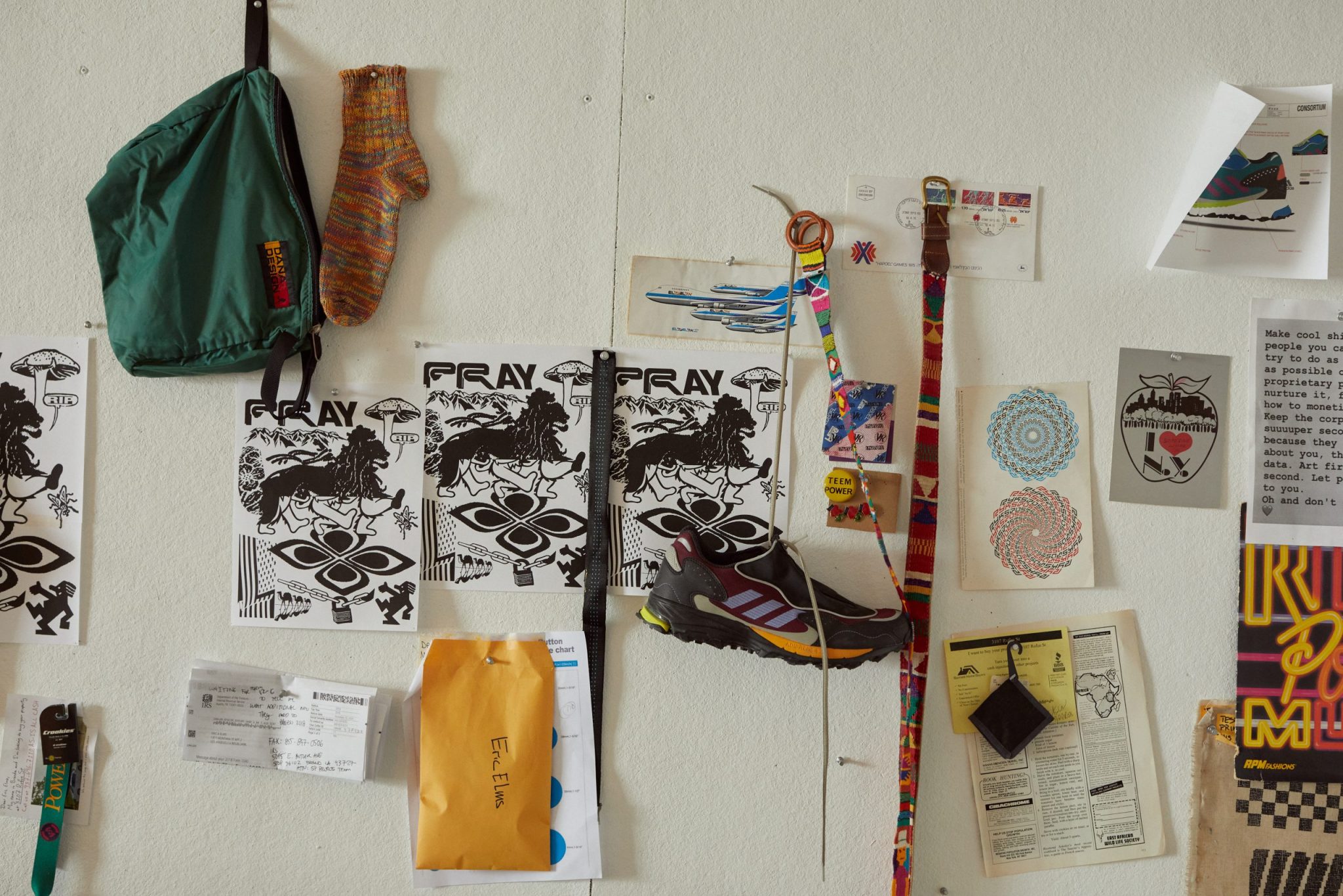
Everyday, he tried to build a routine of creative stimulation. He made it a practice to trawl the “garbage internet.” He added to his formidable collection of books at his home and studio. He used the app Arena to bring some order to the world. “I had been kind of more deliberate about looking through references and weird things. Like making myself go down weird little K-holes, on the internet or in books, just to make sure I’m trying to deliberately come across unexpected things,” he said. “I think for me, design and graphics sometimes comes from really unexpected encounters with inspiration.”
***
Unexpected encounters have always had a way of finding their way to Elms. It’s by now a well-worn fact of his biography that as a suburban teenager growing up in Hillcrest, San Diego, he befriended and was mentored by a 26-year-old Shepard Fairey, who had suddenly moved in and started canvassing the town with his art; and that when Elms moved to New York to attend Pratt, Fairey introduced Elms to the artists Kevin Lyons and Brian Donnelly, better known as Kaws. Lyons ultimately was Elms’ professor and mentor at Pratt, and Elms befriended Kaws and worked as his assistant.
“Looking back now, I’m super grateful to all those people,” he says. “It was fun, but also, regardless of if they were doing it on purpose, they kind of took me under their wing in a way.”
It seemed remarkable then that, despite the close orbit of three artists with such instantly recognizable visual styles, Elms’s work has always been marked instead by its constant change. “When I was younger that was kind of a little psychological struggle sometimes. Is it better to have a specific style or trademark or something like that? I think if that happens naturally for people, it’s a great thing to have. But it’s not necessarily how I work. I work more from an idea point-of-view,” he explains. “Conceptually, what does this work best as? Does it work best as an object? Or do I want to do a painting? How does it best convey the feeling in my mind? I think I used to struggle with that a little bit because it makes things a little bit harder. On the art side of things, when people want to buy something, they want it to look like you.”
He hopes the totality of his work speaks for itself. “But I think over time, between design stuff and design projects, when you put it all together, dozens of projects, there is some feeling to everything and point-of-view and obviously some graphic quality to things. That when you see it all together, there’s an energy to it that comes from me or my studio.”
Elms has also never felt like he was part of a closely-linked generation of artists the way his mentors were. “I think one half-generation older than us is the Beautiful Losers, and a lot of people from our age group looked up to them. Aaron Rose obviously melded that together a lot,” he says. “We didn’t really have a person who brought together a bunch of creatives and defined a group of people.”
Perhaps as a result, a certain nostalgia for the culture and style of the late-90s and early 2000’s echoes throughout his work and life. In some ways, this is explicit: 90s sports iconography makes regular appearances in his designs. The day I visited his studio, Neutral Milk Hotel’s “In The Aeroplane Over the Sea” and Dismemberment Plan’s “Emergency & I” were playing from his computer. But it also reverberates in more conceptual, intangible ways – how brands and scenes at that time were able to marinate and germinate in a local, tactile manner instead of being instantly scattered to the digital winds of social media. It’s the only era of streetwear that he is sentimental about. “GFS and Futura and the Not From Concentrate dudes and the Phillies Blunts stuff – I like all that history. I’m not a huge collector, but maybe I’d collect some of those old pieces that I think are in the lineage of streetwear for me. I think that’s cool from a historical design perspective. Maybe that goes back to that idea of the pre-Instagram era where things were allowed to bubble in themselves for a while.”
Elms’s nostalgia isn’t just for how subcultures would bubble and develop, but also for ultimately what they would produce, and how that could make the world around us more compellingly weird. “For me, it’s not about ‘the internet is bad’ or ‘phones are bad’ or whatever. I’m in and out of being on my phone too. But I think there’s something to be said about back when things moved a little less swiftly – like subcultures themselves and even individual projects had time to develop and mature before everybody saw them. That’s why you got weird pockets of hardcore music in a little town in Wisconsin or Idaho. Or there was a crazy subculture that had a couple years to form and mature and be creative in the East village in New York. Those things probably changed a lot the first two months they were around let alone two years later or five years later. Now it’s just like everything is out there in a week. Which is interesting in a way because you get exposed to everything. But I think it’s cool when things kind of develop in a vacuum sometimes because weird things happen that wouldn’t have happened before.”
Elms had a front row seat for this process two decades earlier when Lyons and Kaws introduced him to one such weird subculture that has since come to dominate the world: the burgeoning, turn-of-the-millennium Soho streetwear scene. Lyons, who worked with Russ Karablin for his brand SSUR, took Elms to the SSUR office behind their shop on Spring Street. “That was my first graphics I’d ever done,” he says. “Russ would pass me graphics to work on and do weird stuff. That was kind of like my introduction to streetwear.”
Kaws introduced Elms to James Jebbia, who soon offered Elms a design role at Supreme. Elms dropped out of Pratt in his senior year to take the job, where he joined a tiny team of five. It was there that he began honing the edges of his style. He found a groove in the tension of his own identity. “Me growing up out here – with a slower pace and a skate graphic, West Coast-vibe – and that juxtaposition to New York affected a lot of work. Not necessarily like image-based, but just the clash of cultures. I wanted to mesh two things together to make something new. You get a new energy if you put two things together in the right way. I feel like really good graphics people can do that – it’s very delicate.”
He’d ultimately leave Supreme after only two years when demand for his freelance work increased and Rocket Gallery in Japan offered him a solo show. “It was just a moment where I thought, ‘I can’t do both. And back then you didn’t need a lot of money to live in New York. Looking back, maybe it wasn’t the most responsible decision,” he admits. “But I was thinking, ‘I want to do these things, and I can’t do them if I’m still here.’”
“If I had started there maybe when I was in my late twenties or thirties, I could have been there for 10 years.”
Instead, Elms spent the next decade-and-a-half expanding into new disciplines and building his studio’s reputation, first as Eric Adorn and then as Partners & Others. He became a sought after designer for brands around the world. He held solo shows in galleries in Tokyo, Paris, New York, and Los Angeles, fittingly done on his own without artistic representation. He published books and zines, sometimes at great expense, through AndPress.
When Elms started Powers in 2016, he hadn’t initially been looking for a reason to do streetwear graphics again, but then he felt the pendulum’s momentum change. “I was burned out doing graphics for a while; I was kind of over it. It was sort of a weird low point, I feel, for streetwear in general. I was doing things I wasn’t excited about,” he admits. “But then I felt like there was kind of an energy with people doing graphics again. Like Peter Sutherland was doing his brand, and there was a personality in some people’s brands or little capsules that were exciting. So, originally, I just did a couple of ideas. I’m going to put these things out. I didn’t even want a name for it.”
With the help of Braindead’s Kyle Ng, Elms put together that first drop, and named it after Powers Street in Brooklyn, where his studio was at the time. “I was scared if I didn’t have a name, people would name it for you. And then I’m stuck with this thing,” he says. “So, I decided to call it Powers Supply, because it came from the studio. It means nothing, but it’s kind of tough and cool.”
Though Powers has an identity, it doesn’t have a singular logo or identity. In keeping with his own overall aesthetic, he has slowly built a constantly morphing visual universe around it. “I like branding and branding systems, so for Powers, even with logos, I’m always fiddling with it. What’s the simple logo mark? How can it turn into a system and change? What’s the third layer of logo identity? There are so many small brands with a few graphics, and that’s cool. But I like when there is a repeating logo system with themes coming back around.”
Powers became a place where Elms could play with new, weird ideas alongside others he’d been riffing on for years. Kilroy, a reference to a graphical meme from World War II that he views as “mascot” for the brand, has appeared in Elms’s work for over a decade. “Powers is kind of a bridge. I guess its identity is that it’s an outpouring of my studio. It’s the one thing that maybe pulls from both parts in places,” he says.
“I think I can take different parts of my brain that don’t necessarily mix here with [studio] work that can come together in weird ways for Powers. And that benefits all of it. And I’m the only one working on it, really, on the creative side, so if I open it up to let it combine different parts, it makes it a little more fun for me.”
Like any streetwear brand, especially one with the pedigree of Powers, the legacy of streetwear behemoths like Supreme and Palace – brands that have been able to retain their iconoclastic character as they’ve grown into global institutions – can loom large. But in a world flush with a constant supply of new brands, he sees an opportunity to occupy the hollowed-out center. “I’m not trying to keep Powers so small deliberately. I think if brands with creative integrity or mindset can get to one-size bigger, that’s super cool,” he says. “That middle ground is kind of hard, but I think it’s interesting if you can get to the size – just a little bit bigger – and still be doing interesting stuff. I think that’s a cool experiment for me.”
That morning I met Elms at the Powers store, you could feel a bit of the balance of this moment for the brand. Just two days earlier, Elms had held an opening party there, with a steady stream of friends and industry colleagues and fans turning out in large numbers to support the store.
Toward the end of my visit, Elms got up from his chair and walked to the bookshelf. After a moment, he pulled a paperback off the shelf. “This is a really good book, you should read this,” he says to me, leafing through a copy of Michele Bernstein’s All the King’s Horses. “It’s weird – it’s just a really weird novel. It’s a quick read, but it’s amazing.”
Just then, a man in cargo shorts and sandals walked in.
“It’s not Echo Park Appliances anymore?”
“No, no, it’s not. Sorry. It’s been 18 months since they closed and people are still coming in. Maybe I should start making appliances.” He didn’t laugh, but I was pretty certain he was joking.


