As the textual equivalent of a speech style, typefaces are instrumental to design work, complementing other visual elements to give a project an immediately recognizable “voice.” Thanks to digital typography, designers have access to tens of thousands of different typefaces meaning more directions a project can take and more ways in which a written language can be expressed. After all that searching and you still can’t find it? You might still have the option of creating your own with 250 upper and lower case letters and punctuation. If you’re working in a language like English, that is.
But when you’re a designer working in Chinese and a typeface needs over 80,000 characters to be considered “complete,” how do you even tackle a project that is bound to outlive you and more importantly, why start in the first place?
I sat down with designer and writer Caspar Lam of NYC-based Synoptic Office to hear how the typeface Ming Romantic was conceived and the impact of similar innovative typefaces on Chinese design.
It all began with a simple enough request.
While Caspar was working at an NYC-based studio prior to Synoptic Office, he was tasked with finding a romantic Chinese font for their client, Vogue China, who was looking something in the realm of a Didone style—characterized by a striking combination of contrasting thin horizontal and thick vertical line widths and an unornamented modern form.
The issue? There wasn’t any such type in existence.
After the project with Vogue China finished, Caspar discussed the idea with co-creator and creative director YuJune Park and his team that included designers Abby Chen, Dustin Tong and Gabriela Carnabuci. “We were sitting together in a room and we said, ‘Oh, why don’t we make a Chinese typeface,’” Caspar recalls. “How hard could that be? Literally, it was that naive.”
Thus began Synoptic’s five-year journey to explore and reinvent the way modern Chinese typefaces are created.

A page from the Ming Romantic Reader published in conjunction with the typeface’s launch.
Ming Romantic came about by a combination of circumstance, curiosity and as Caspar would later concede, “youthful optimism.”
The team originally planned to include an accompanying Korean typeface in a similar style. Unfortunately, that plan was quickly abandoned within the first month after the enormity of the project became apparent.
Why? There are several factors that make creating new Chinese typefaces exceedingly difficult, many of which you could say have existed since antiquity.
For starters, written Chinese is vast and intricate.
This complexity has both given the language its richness, but also hindered its ability to fully utilize emerging technologies that have enabled other languages.

A special edition poster promoting the new typeface.

For the Western world, the impact of the printing press was huge. It’s probably a simplification, but when literate and relatively well-funded monks were the only ones hand-copying The Bible, suddenly being able to churn out copies of the then best-seller at the pull of a lever was a gamechanger.
It led to the greater dissemination and democratization of knowledge in the West. And as printing technology progressed, so did the typefaces that were conceived to meet different design challenges that presented themselves such as the invention of cost-saving italics that allowed a printer to fit more letters into a block.
These developments would eventually lead to the first ‘modern’ Roman typefaces Bodoni and Didot with their sharp serifs and high contrast between vertical and horizontal line weights. The genre of typefaces that’d descend from these two, collectively known as “Didone,” would also become the lens much of Ming Romantic was conceived through.
In case you were wondering why it’s called Ming Romantic, it’s named for the dynasty where the popularization of ceramic, wood and bronze movable type marked a shift away from script styles involving brush strokes such as the use of straight lines. The typeface named for this period also marked the starting point for their exploration.
“If they created a block for every character, that’s also a huge undertaking. You needed an emperor or somebody with a lot of money hire a lot of people to do this type of work and sustain it.”
Although movable type was invented in China and used there as early as 1040 AD, one of the largest limiting factors to developing Chinese printing presses and the typefaces used in them since has always been limited by the costs of producing such a large character set.
In ancient times, it was popular to carve characters or whole texts onto woodblocks and stamp the inked blocks onto paper, a process known as xylography. But to do that needed an emperor or someone with a similar level of wealth to support. It was the kind of influence that could keep someone on standby to carve a block on demand for a character that needed to be printed if it didn’t exist yet.
And that same issue of scale persists today. A non-designer could do a quick browse of a DaFont.com and end up with tens of thousands of different typefaces for English, but a committed search of similar sites for Chinese will yield only a fraction of that.
Even when the modern demand for new Chinese typefaces has increased along with the funding to create them, a typeface using the Roman alphabet could be created by a single sufficiently compensated or passionate designer. For Chinese, however, you’d still need a team of designers working over several months or in Synoptic Office’s case, years to make a usable Chinese typeface.

This is because a typical Western typeface needs only about 250 characters that include the alphabet in upper and lower case, punctuation marks and special characters like currency signs and the ampersand.
The problem is, a modern Chinese one needs those Roman characters along with 2,500 to 3,000 common-use Chinese characters to be useable such as for titles.
Granted, those 250 Western characters used in most Chinese typefaces are included for completeness and are usually copied from other typefaces.
The results are Roman characters that are jarringly out of place next to the Chinese typeface, something of a bastardized Times New Roman.
Caspar and I joked that these characters are likely an afterthought left to a hapless intern.
But for a typeface intended for professional use—and for body text, for example—where the variety of characters is bound to be greater, tens of thousands are needed and over 80,000 to be considered “complete.”
“Theoretically, you could work on this forever until you die because the character set is so huge. If we wanted people to use it quickly, maybe we should set expectations and say ‘well, maybe we won’t complete it this first go.”
It bears mentioning that Synoptic Office isn’t a type foundry—that is to say, they don’t create typefaces fulltime. I asked Caspar how then a project of such magnitude was executed over five years running in the background.
He began by comparing approaches used by type foundries and Synoptic. One of these was writing the character by hand and then scanning it into a graphics program and live-tracing it. But as Caspar notes, this was not a suitable approach for Ming Romantic as its design ethos was to distance itself from handwriting and instead explore typography.
Taking a page out of the software development world playbook, Synoptic is releasing Ming Romantic in successive versions. This not only means the team’s work can be published even before it’s complete—and with so many characters left to go, it can be hard to pinpoint that due date.
Yet even with the added leverage of graphic design software and scripting languages that can produce characters with similar elements based on successful iterations, like all design projects, Caspar explains that individual characters still need to be finessed or optically adjusted to be visually pleasing.
It means carving out time every day devoted to drawing a character using a blank grid on a screen. In the beginning, the time commitment meant the net output was maybe only one to three characters a day.
“After the initial explorations were done, it became a little more robust and efficient. Because then you could copy a lot of the forms you drew previously and then modify them for forms that are similar.”
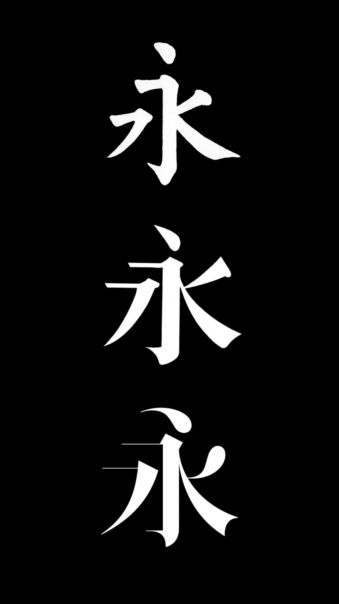
The evolution of Ming Romantic.
These characters sit on a large master list that the team goes through over and over again until items are completed, with milestones set at increments of 500 characters.
Intrigued, I ask him how the team celebrates.
“With a cup of coffee,” he laughs. “Or maybe just walking around because it takes a toll on your eyes. I already have very bad eyesight, so you can feel your eyes degenerating after a while, and you know that this is actually not good for you in the long run!”
But besides being measured and tweaked against the consistency of the entire character set, Caspar points out another crucial criterion.
Does it look Chinese?
Contrary to a popular myth, Chinese characters don’t each represent a “picture.” Over 80% of the characters are logosyllabic (or pictophonetic if you prefer). What that means, simply, is that that they’re made by combining of different parts called “radicals.” These 214 radicals are either other complete characters or variants of them. Some radicals hint at the pronunciation of the complete character and others, the meaning.
Even with the countless combinations variations of these elements, there exists an extra layer of requirements for Chinese type that is complemented by objective visual design principles.
As someone whose university-acquired written Chinese looks like an elementary school kid’s ultra legible but untrained scribbles, I don’t have the requisite lifetime of practice and cultural reinforcement necessary to judge absolute authenticity. This was when Caspar mentioned the contrasting case of writing by Chinese learners of English.
Sure enough, a glimpse at some writing samples shows a few extra embellishments that are decidedly not native to the English canon of handwriting styles. These anomalies are pretty easy to spot, especially if we’re just working with the standard 26-letter Roman alphabet.
For example, you’d likely think something was off if the capital ‘D’ in Delaware appeared as small as the adjacent lower case ‘e,’ even if that was the design intent of the typeface.
With so many “moving parts” in a character, let’s just say that for both typography and writing, there are lots of extra things that could look off to the Chinese eye.
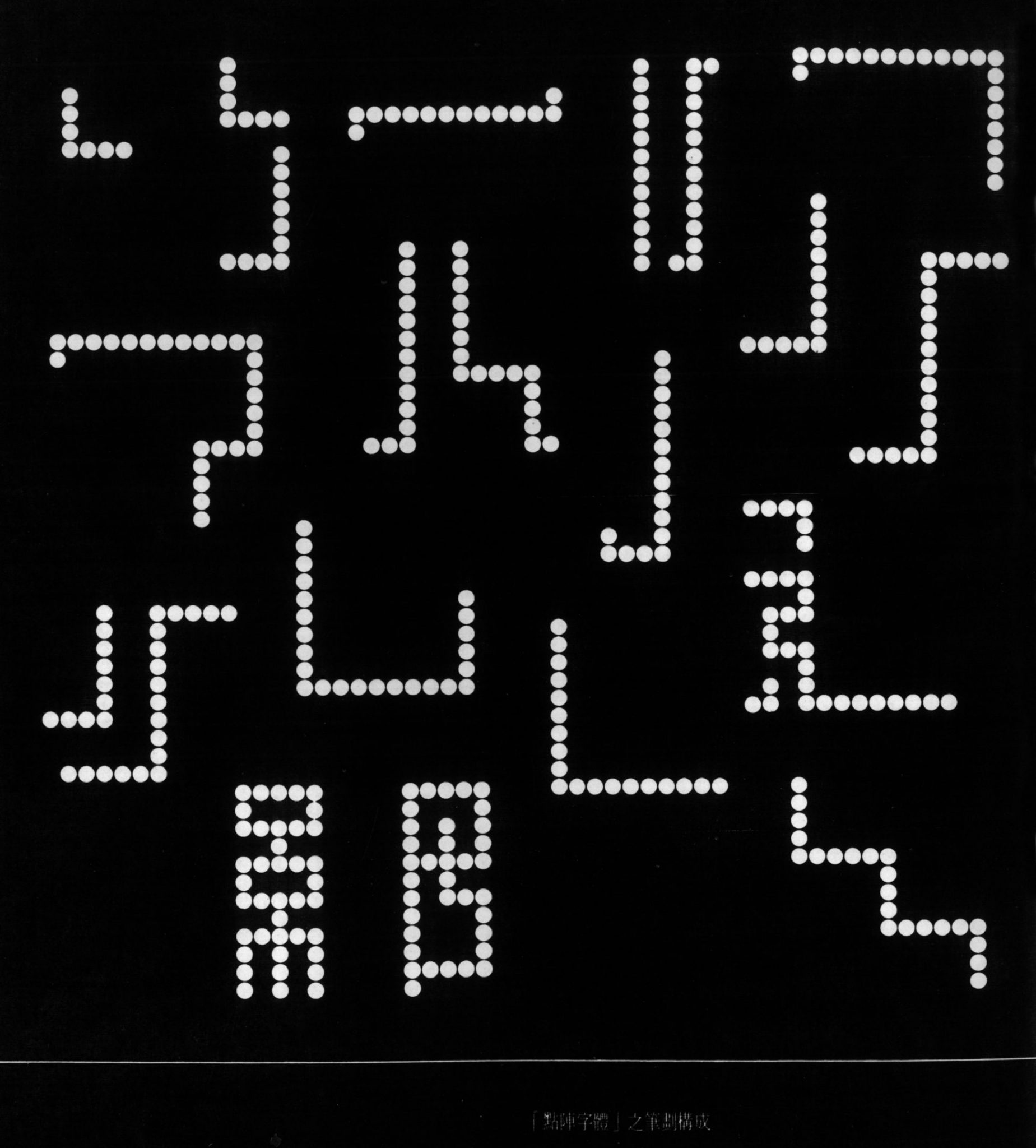
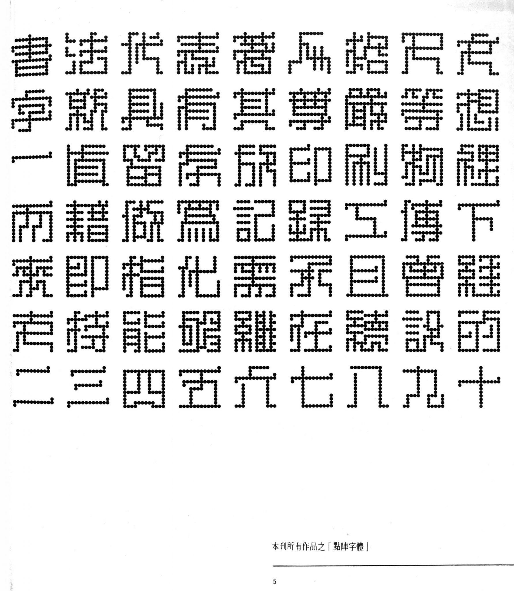
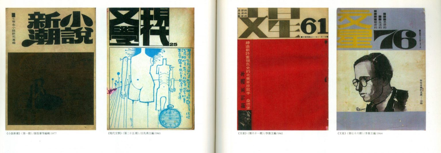
Taiwanese magazine covers from the ’60s and ’70s. (Above: Dot matrix typography from “Computer Aided Chinese Typography” by Chen Kai Yan and Chen Hing Wing)
“We wanted to pursue it because it was such an interesting topic for us. Our studio, we tend to pursue projects that we find to be of cultural relevance and of cultural interest.”
It’d be a disservice to suggest the impact of Ming Romantic was simply to see how a Chinese typeface could be created from scratch. Besides the practical challenge of producing a typeface with a more intuitive and efficient methodology, Ming Romantic also exists as a stylistic and you could say, cultural challenge to existing visual norms in the Chinese context.
Despite the small but growing body of innovative Chinese typefaces, Chinese culture remains heavily attached to its history in the calligraphic arts for its expressiveness.
Caspar describes a sort of “mental barrier” in the Chinese context, offering the example of when he talks to his family and friends about his work on Ming Romantic.
Upon being asked what kind of calligraphic face he was working on, he would have to explain the difference between typography and calligraphy, where the former has “an aspect of mechanical reproduction and product” and the latter is a means of personal expression.
It’s this ingrained attachment to such a long esteemed tradition that has made giving the two art “their space” a great if unseen challenge to Chinese typography.
“Even Chairman Mao, he was a calligrapher. It’s a very reactionary activity for this revolutionary, but it highlights this sort of myth we have as part of cultural identity or who we are as Chinese. ”
As the first combination of a traditional Chinese script and such a high-contrast modern Western typeface, Ming Romantic is an exciting development for Chinese type, but Caspar points out that the history isn’t entirely devoid of similar attempts.
When Caspar and YuJune discussed Ming Romantic at the Typographics 2016 design festival, they showed many remarkable examples of typefaces from the 1950’s and after—a relatively unrecognized heritage of Chinese exploration in typography.
“The idea of experimentation in Chinese type is somewhat of a rocky history because Chinese history has tended to allow the forms which are considered canonical while the rest of the experimentations tend to get buried,” he explains.
With the exception of the art and design worlds, the visible lack of provocative Chinese fonts in everyday life seems to confirm this.
“So you always hear about the great calligraphers or the things that have worked, and the things that haven’t worked, you have to search really hard to find them.”

To fully grasp the impact of accomplishments like Ming Romantic, you could think of it this way: How many projects involving text would either fail to reach their full potential or even be realized because they lacked the typeface to express its visual identity? It would be like if you only had say, Times New Roman, Arial, and perish the thought, Comic Sans at your disposal.
While Caspar stops short of suggesting Chinese design would “mushroom” if it had more typefaces to channel its creative energies through, he does offer that more typefaces would allow more directions and greater freedom for design work in Chinese. For now, Ming Romantic can proudly count itself as the first Didone-style Chinese font of its kind and celebrate the end of a long leg in a much longer journey.
At the time of this writing, Ming Romantic’s first release reached 2,300 traditional characters in three weights, which they unveiled on February 1 in New York.
After our chat, I asked him later by email what the logical next steps were for Ming Romantic. Aside from taking some much-needed rest to distance and reflect on the project, he mused about the potential for a simplified Chinese version subject to demand.
True to Ming Romantic’s original mandate, there may even be bolder explorations down the line.
“One idea which I find fascinating is exploring ‘ligatures’ in the typeface,” he writes, referring to the stylistic combining of several characters into one, similar to the English Æ. But in light of the very history that inspired Ming Romantic’s creation, that could be a slippery slope.
“In some way, this is a dangerous idea because ligatures have their origins in handwriting, and going too deeply into this area would turn a typeface into a script.”


")


