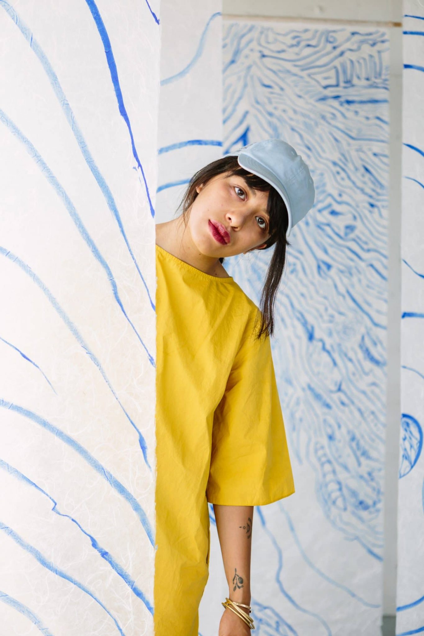
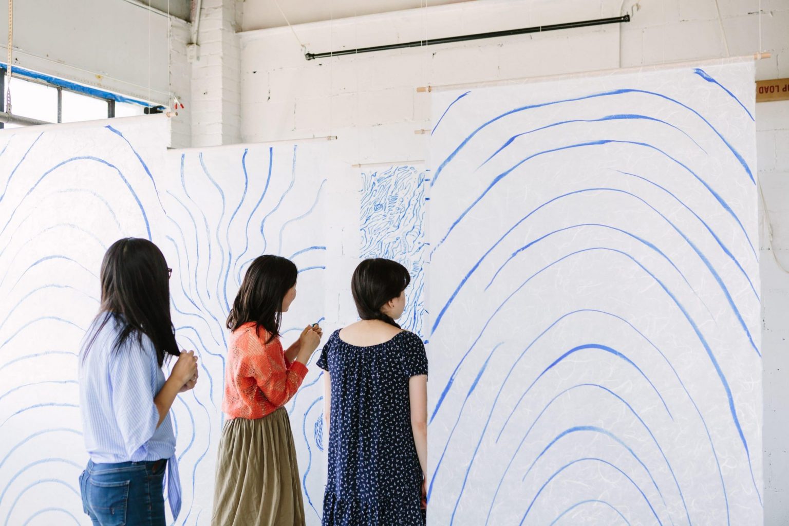
MAEKAN member Jeremy Leung recently presented a new body titled “Veiled Emotions.” The focus of the exhibition, hosted at Lunchroom Collective in Toronto, was on expressing a wide range of emotions through a multi-layered physical experience using traditional Japanese washi paper.
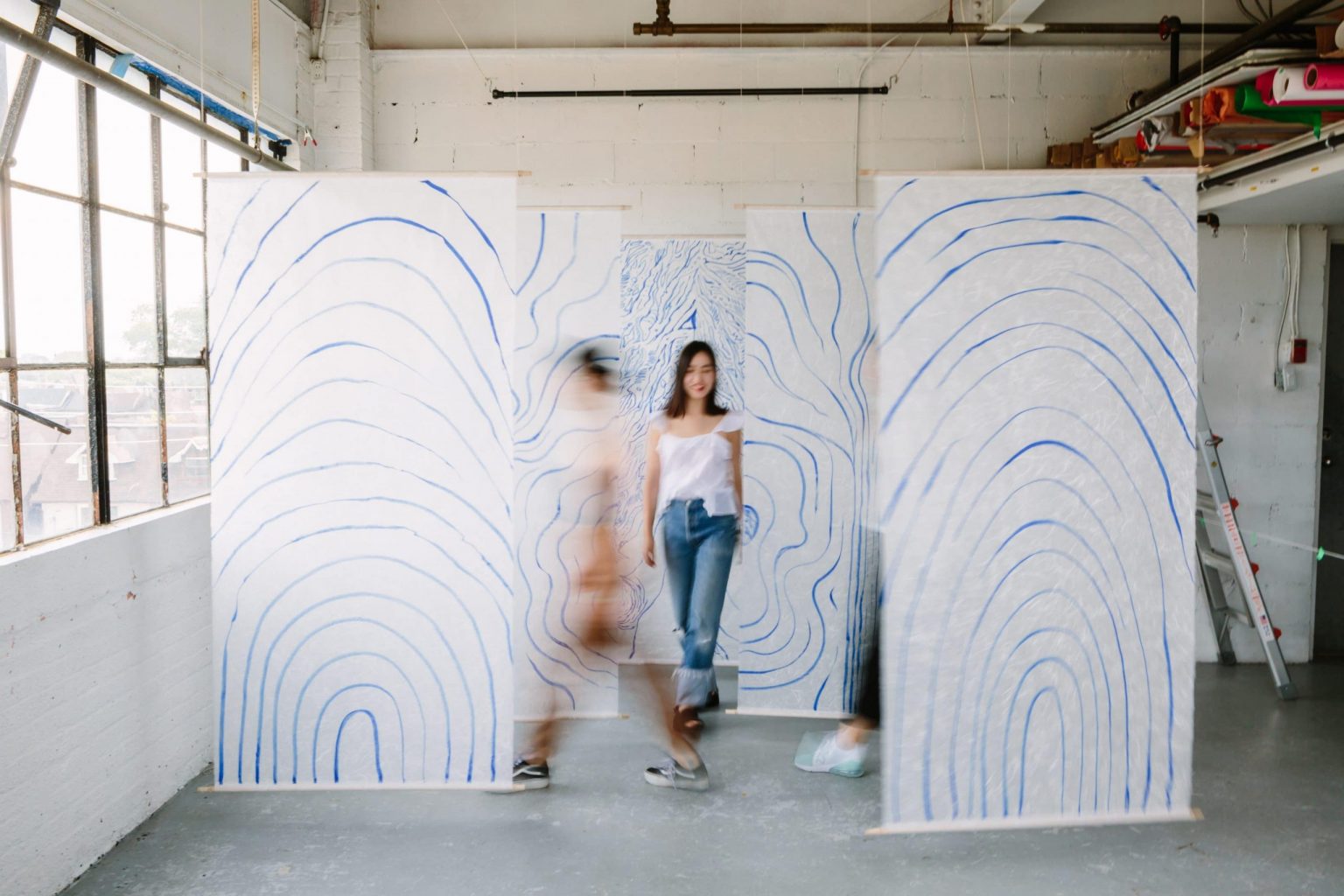
Although favoring the tangible, interactive quality of physical art over his usual digital productions, Jeremy created an environment where viewers are encouraged to interact through their digital devices and hopefully create their own narratives through that different layers meant to represent tranquility, tension, and ultimately chaos. We spoke to Jeremy about the processes and final product of his most recent installation which was meant to push past any sort of “kitschy homage” of Japanese traditional painting, but rather a wholly new contemporary aesthetic.
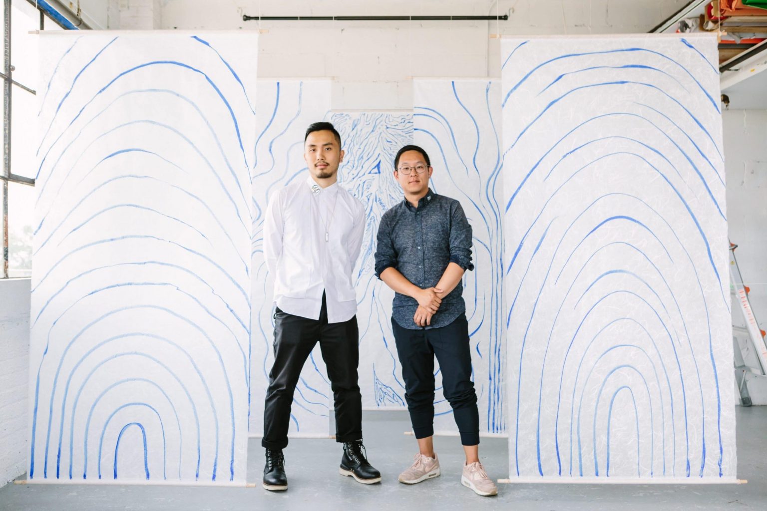
Jeremy Leung (left) and frequent collaborator Gabriel Li.
Tell us a bit about yourself and your work.
I’m a freelance illustrator and visual artist based in Toronto, Canada. I make images for editorial publications, giving visual form to the written words of various authors and journalists. I also create my own stories in the form of self-published zines. My work primarily consists of human figures interacting with flowing lines and patterns. Over the past few years, I’ve straddled between doing both graphic design and illustration as a career and recently made the jump into illustration full-time.
How do you feel your work is perceived publically?
I feel like the public sees me as someone who has his passions spread out over the creative spectrum; from film (being a self-proclaimed cinephile) to street fashion and photography. How it translates to my work in a cohesive way is something I’m constantly working on. My primary focus in the coming months is working on how these individual passions can intersect and form a unique individual voice.
How did this opportunity come through?
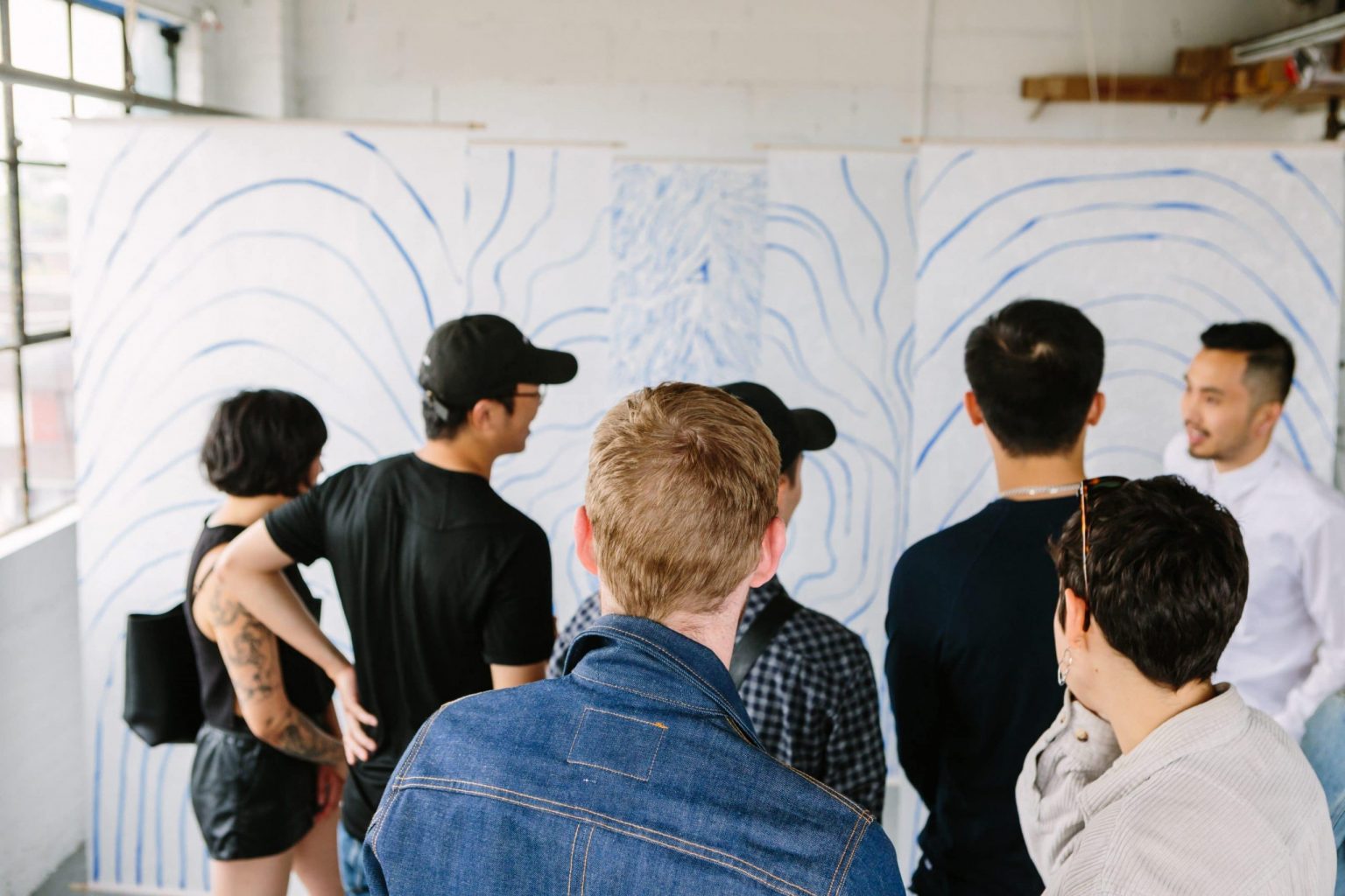
I’ve yet to be commissioned to do a large-scale mural piece or installation where I’ve been able to have complete creative control. After discussing the idea of an interactive installation with my key collaborator, Gabriel Li, we decided there’s no reason we can’t create the opportunity for ourselves. Historically our collective, Lunchroom Toronto has put on community events that invite 1 or more of our members to collaborate on an installation. The goal is to activate a physical space and invite our larger creative community to interact with it. For this edition, we decided to put the focus on illustration.
Based on “Lunchroom,” is there any connection to food in your work?
The ethos of this group is that we share in our paths together as freelance designers, illustrators and photographers while also sharing family-style meals. So from a food perspective, there is no direct correlation, but the philosophy of our group, that we can approach challenges together, very much affected the production and logistics of this project. This was truly a team effort and I couldn’t be more grateful for the trust and confidence we inspired in each other.
How did you settle on the use of washi paper?
The washi paper was a deliberate choice because of its inherent beauty; the particular paper we chose had these beautiful fibres dispersed across the surface in a way that resonates with the linework I create by hand. Secondly, the translucent nature of the paper allowed light to pass through in interesting ways as the day progressed. Lastly, I loved how the lightness of the paper’s weight provided subtle movement as gentle breezes of wind flowed through the room.
How is it working with the material?
The material was surprisingly sturdy and robust despite our need to do a few things in preparation for hanging. We sewed a loop on each end and inserted a dowel to give each sheet some necessary counterweight. The paper was very forgiving and held up to all the ink tests I did in advance.
Do you approach your mediums differently whether they be digital or tangible?
Absolutely. In fact, this entire project was an attempt to break out of my usual way of working digitally. I wanted to have that tactile experience of the paper underneath my hand and wrestle with the ink’s natural inconsistencies when applied on a surface. The freedom to endlessly undo any mistakes when working digitally was a privilege I wanted to remove for this project.
What does the physical presentation of your work teach you?
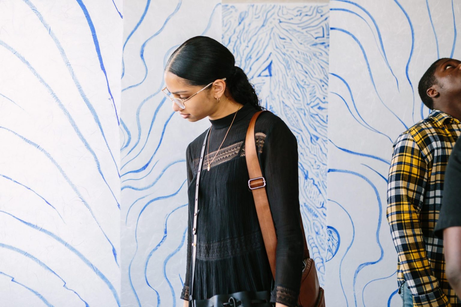
It was very gratifying to be able to present drawings that were so large in scale and having friends walk in between each layer of paper. This made me realize how this exhibition was, in effect, a physical manifestation of the worlds I intend to create in my digital illustrations. As for people’s reactions, I was happy to see friends having fun creating their own photos and Boomerang compositions within the space. Our instinct from the beginning was to actively involve the participant, and I think that instinct paid off.
How important is it physically see artwork?
Funny, I lament how we often experience art and sightseeing through our phone screens, often before letting our eyes absorb what we are seeing. But in a way, I wanted to embrace this human phenomenon of over-attachment to our phones and make composing the artwork on a phone screen an integral part of the experience.
What feelings did you want to convey?
The installation was called Veiled Emotions because I wanted to express the spectrum of emotions that these line patterns mean to me personally: calm and tranquil on the front-facing layer, tension on the second and utter chaos on the third. Though I certainly don’t expect people to resonate with it in the same way, my hope is that someone can come away with their own interpretations and feel empowered to create something new in the space with their devices.
Any last things you want to add?
One of my main goals was that I didn’t want the installation to appear like a kitschy homage to Japanese traditional painting; something you might find at a tea house or restaurant. As beautiful as those art forms are, I felt the need to squarely root this in a contemporary aesthetic.
To see more of Jeremy’s work, visit his website here.
This episode features none other than Charis Poon, who writes and designs, does creative strategy for Intertrend, and co-hosts Making It Up in addition to being, of course, a member of the MAEKAN team.