From the Portfolio of… is a new MAEKAN series that features creators of all kinds talking about their work with a focus on the backstory. From the Portfolio of… discusses inspirations, the way work references and responds to other things, and what personal work stirs up in the creator’s memories.
Guillaume Ferrand is an illustrator who approaches his work with careful research, deliberate intentions, and a willingness to experiment. He draws inspiration from literature, old movies, classical paintings, architecture, fashion collections, tiles—anything and everything he comes across can feed into his creative output. Besides being an illustrator who is able to draw on many resources, Guillaume uses his artistic series as ways to think about who he is and question his own behavior and prejudices.
He lives and works in Paris, France. After graduating from the Nîmes School of Fine Arts having studied video installation, he went on to positions at Maison Margiela and Dior Homme creating all types of visually communicative work in order to fulfil his dream of working in fashion. While his time at the two fashion houses was instructive, he found that he needed more creative freedom. Recently, he’s made the leap to freelancing full-time in order to explore all the different ideas and concepts he’s been yearning to express. Guillaume shared with us his thinking behind and process in the making of five different series, highlighting particular individual pieces. Hearing his words about his own work adds color to perceptions of the illustrations—there’s far more going on than just what you see on the surface.
Les Cheveux
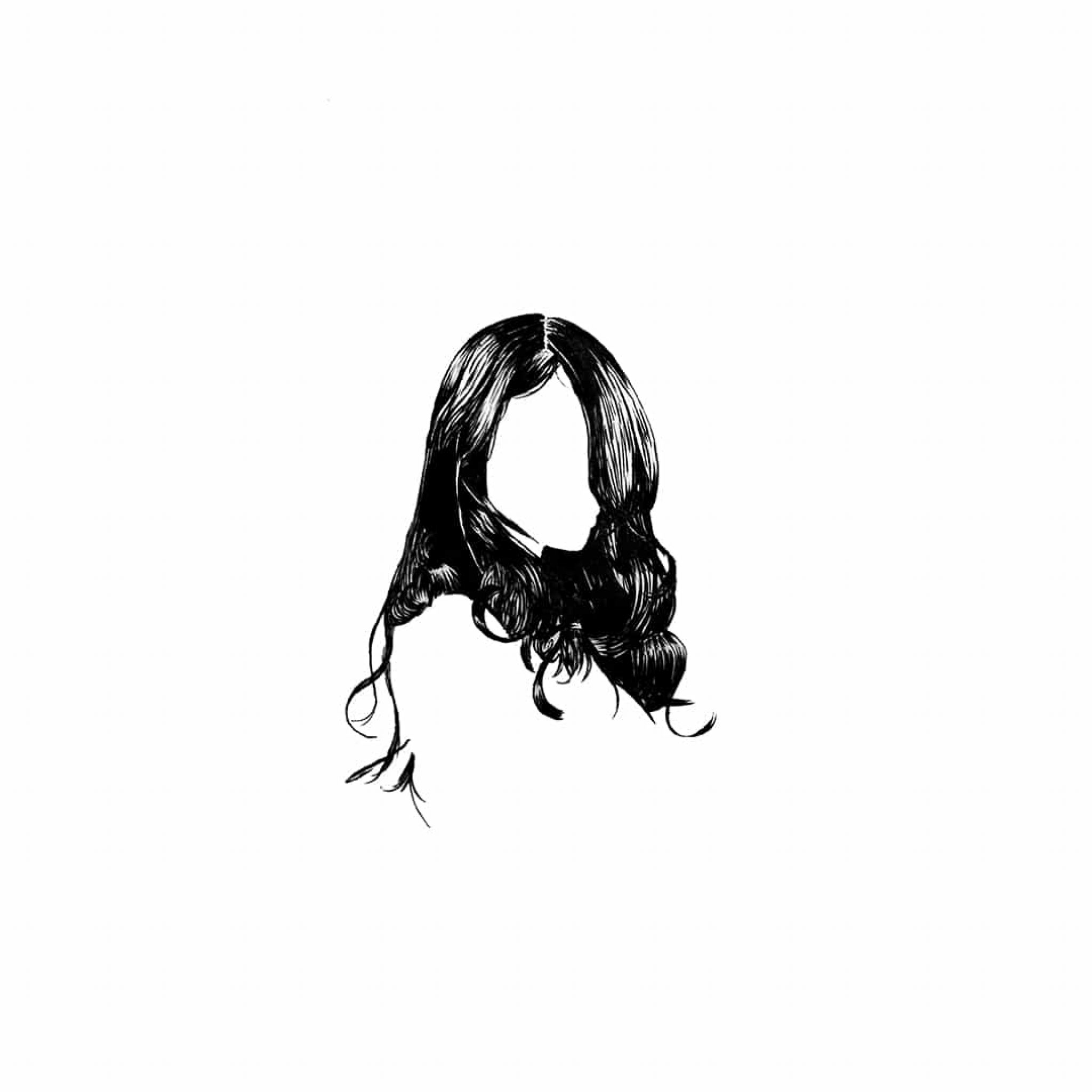
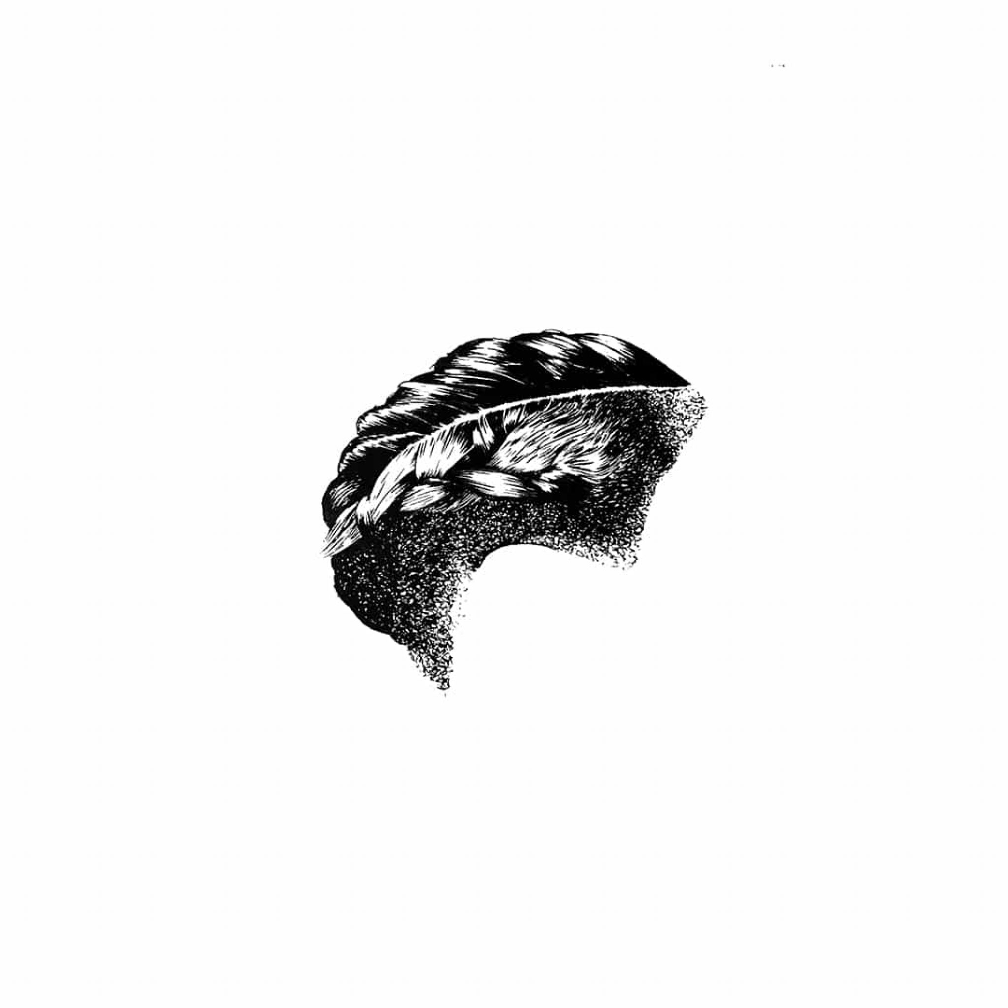
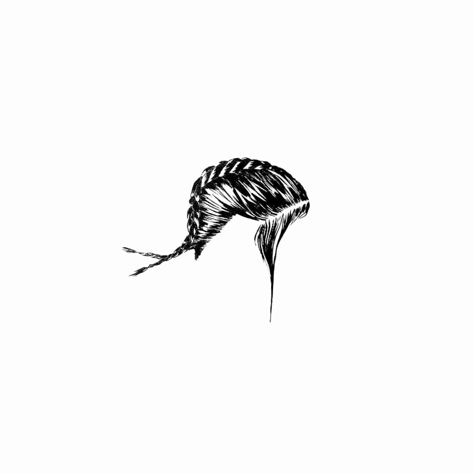
This series is called les cheveux in French, which translates to “the hair.” And it’s quite an old one actually, dating back to 2016, I guess. But I like to keep it in my portfolio even though I don’t work with ink much these days.I still find it relevant and clear and people always respond positively to it.
I consider myself to be a feminist trying hard to be an ally and that being a straight white male led me to question and modify my behavior and approach to sensuality and sexuality a lot over the years. I mean, the male gaze on the female body seems to be traditionally one of a landlord looking for new property, which explains why women were and still tend to be objectified so you have to wonder what is considered normal or gross. Why is it still a political act for women to refuse to shave their legs and armpits? Why can a man walk around shirtless in parks during summer or in music gigs, for example, while it is not even considered when it comes to women? A lot of prejudices are so deeply anchored in our society system that we don’t even notice them.
Continuously researching and questioning led me to the question of hair and hair-dos specifically. I started to wonder why I always found women’s hair to be a very sensual thing, why long hair is the standard in western societies and short hair’s still a strong move, which led me to different symbols through cultures and history and I realized it was one of the only things that convey sensuality, strength, politics, and threats all at once.
In Europe during the Middle Ages they would cut hair of women they considered as evil or witches. In all different religions you find reasons to hide the female hair, either to separate decent women from the ones of small virtue or to avoid to provoke men’s temptation, for example. After World War II, in France women who collaborated or who had an affair with Nazis got their hair violently and publicly trimmed. Black women have a strong relation with hair too, as something that takes time and money, something that they love, something that some people often try to touch without asking and so on and so on. Examples are countless and I find it fascinating how such an organic thing became so important. Focusing on the hair-do alone and leaving out everything else—face, body, clothes, basically everything that could identify a person—felt like a good way to question all that, and show the strong diversity of styles and, therefore, diversity of women today.
I like this series because it reminds me to keep questioning my status and of the women who make me better and who made me uncomfortable and pushed me to question everything I considered normal.
Elodie

This portrait of my friend Elodie and her cat Tapioca is part of an ongoing series called “Portraits of Friends”. I wanted to talk about this one specifically, even though it is already quite far from what this series has turned into in terms of the use of colors, the contrast between a realistic subject and a more abstract environment, because it was the turning point that made this whole series what it is now. When I started it I was just using colors for the first time and wanted to make a series based on a book by Marguerite Duras called Moderato Cantabile. However, I got stuck when it came to drawing characters. Nothing worked and I simply didn’t know what I wanted because I never drew imaginary characters before. What should they look like? Which medium should I used? So I decided to start drawing my friends as a practice. The first drawings were of A4 ratio with no environment, very inspired by Hockney but without the genius, just very much practice.
When I asked Elodie, we decided to do it on a Sunday. I went to her place, we talked, drank some tea, and then proceeded to work on the composition. She works in fashion and has this amazing style, both very natural and highly sophisticated and ultimately has a lot of clothes and shoes. So for the first time I really took some time for styling with my subject and then we did the same with her living room. We moved furniture, looked for the light, she got flowers the day before specifically for the portrait. Once we were done, the pictures I took for reference were so good that I naturally realized that I needed to show everything, not only the subject but its environment too. I’m of course not bragging about my potential photography skills here but just the happiness of building something good with a friend. I remember being ecstatic on the way back home, texting my girlfriend and everything. This is the kind of moment when something clicks, when you feel you pass on a new level.
This specific drawing made the whole thing turn into a series in itself. Not a simple practice anymore, but something with interest to me. Something that allowed me to explore the codes of classical paintings as I studied them, the structures and symbols, the meaning of masterpieces such as Ingre’s Napoleon or Odalisque or Turkish Bath, for example. It led me to structure my compositions, to feature the subjects’ more important belongings in order to add depth, through symbols for example, or to use specific references, and for that it is one of the most important of the series.
Buto
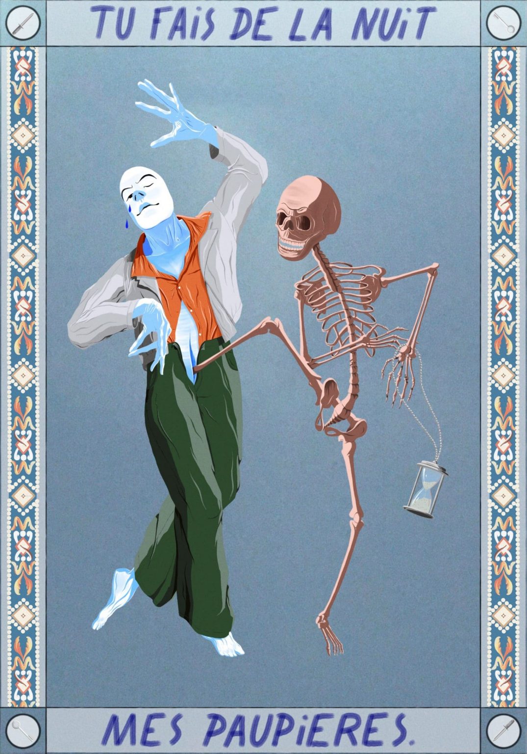
This illustration is the last of my ongoing Buto series. The whole project is directly inspired by the dance of Buto, a style born in Japan in the ‘50s as a reaction to World War II. I am fascinated by how the bodies move, by how much they express through very small and slow movements, how it goes against classical codes of ballet too by taking very weird and unexpected positions.
As I am so very into hands in general, I always start with the hand gestures. Sometimes drawn out from books about Kazuo and Yoshito Ono, two of the art’s most renowned actors or from performance videos, but also from memory, or by looking at my own hands. Then the body follows and all the rest depending on what I wish to reference or convey.
This one specifically is inspired by Hans Olbein’s Dance of Death woodcuts, and the skeleton’s position is actually very close to one of his body of work. You also have the hourglass found in every picture of this series which is an obvious memento mori added to the skeleton and a biblical symbol, another thing that I’m very interested in.
I love this series because it allows me to merge a bunch of different practices and interests of mine. The texts are from my notebook, the tiles are reproductions of tiles that I’ve been collecting for years by taking pictures when I travel. And it also allows me to delve into fashion illustration by drawing them with actual looks by designers I love. This one for example is from Telfar’s last collection, a designer I truly admire, and one of the few who currently change the game and change our perception and stereotypes about genders, trends, black identity and so on.
It is also interesting to me because they’re all digital illustration, which is probably the most famous kind nowadays. And I think I use it as a laboratory to challenge myself to create a style that is both personal and different, closer to hand drawings I guess.
I also wanted to create a neutral character, a persona that wouldn’t clearly identify to a specific gender or ethnicity. It has no ears, which makes the head perfectly round, no hair. The eyebrows and the mouth refer to Japanese traditional prints, of course, but the skin is simply the blank paper with hues of blue.
I’d say I consider it very important to the society we live in—avoiding cultural appropriation—which is why I try not to fetishize Japanese culture or the idea I could have of it.
India Song
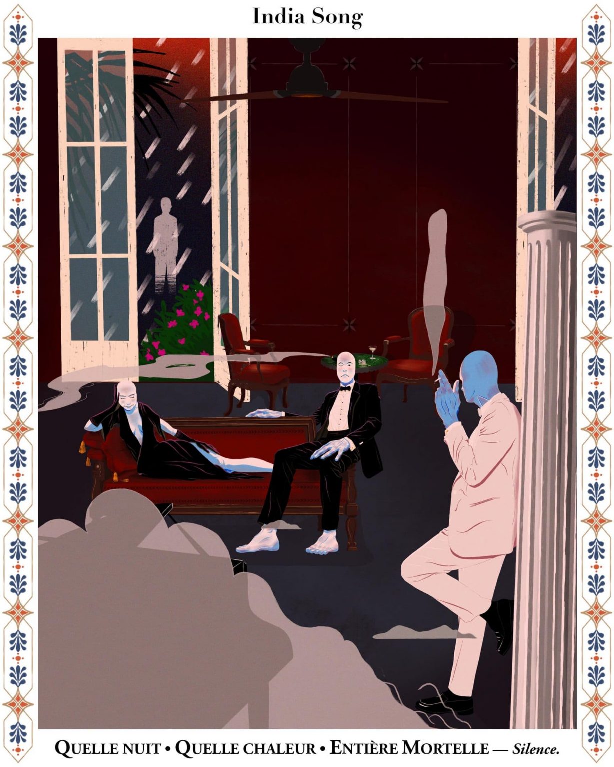
The India Song project is my most recent series and it conveys elements from both the Buto and the portraits one. As I explained about my portrait of Elodie, I wanted to illustrate a book by Marguerite Duras, one of my favorite authors, for a long time now but simply didn’t know how to draw my characters. It is only through practice by drawing portraits and Buto dancer s again and again that it naturally came back around and as I recently reread India Song, which is a theater play that takes place in India during the French colonies, I could clearly picture the different scenes in my head, the character’s behavior, the costumes, the mood. It is all so poetically and precisely describe in the book that you basically just have to apply your own graphic style and references to it.
What I really wished to convey in this scene was the profound melancholy of it all. The characters are described as living statues who proceed to move very slowly later on surrounded by this indecent wealth, the rich furniture, the piano, the oleander outside, the perfume burners. You can also clearly feel the heavy warmth in the book translated by a too-slow ceiling fans and very very low lighting, which is why I went for deep red and wood tones, slight textures on the wall and floor recalling of tapestries and carpets with a lot of smoke circulating in the room. Once I finished drawing everything I even applied a grain layer to add even more drama to it all.
The text appearing in the frame is the title of the play and a quote from the first act from which this scene is drawn out. The fonts are also the ones used by the editor, which seems important to me to really anchor this illustration and the others to come in the book.
I consider this drawing as a new step for me because it merges the character style of my Buto series, with weirdness and out of proportion limbs, with the idea of rendering a whole environment around them which is closer to my portrait series. It also allows me to get quite precise and satisfy my geekiness when it comes to render things out. The costume’s colors are described in the book of course, but I took the liberty to add gold cufflinks, hand-knotted bowties, a spilled glass of champagne at the background etcetera.
This is all very selfish, probably, but more generally I think details are very important in scenes like this in order to keep it all accurate and relevant. I think the viewer needs to feel I know what I’m talking about. I can play with a lot of small symbols and details and delve into my love of old movies such as Marcel Came’sThe Devil’s Envoys with it’s beautiful night scenes all rendered in strong shadows and heavy use of gray.
I like to think that illustration can be a great vessel to bring new things to the viewer, to make them curious. And if this series motivates even a few to go and purchase that book or any of Duras’ books honestly, it’ll make me truly happy and honored.
Carnets

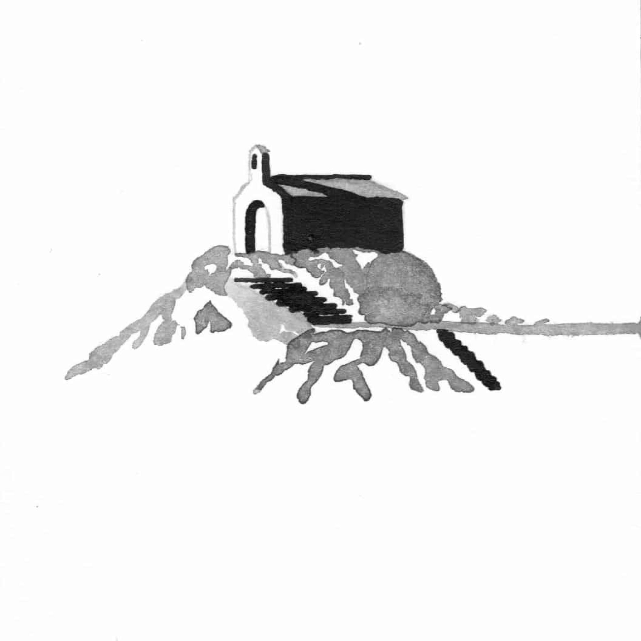
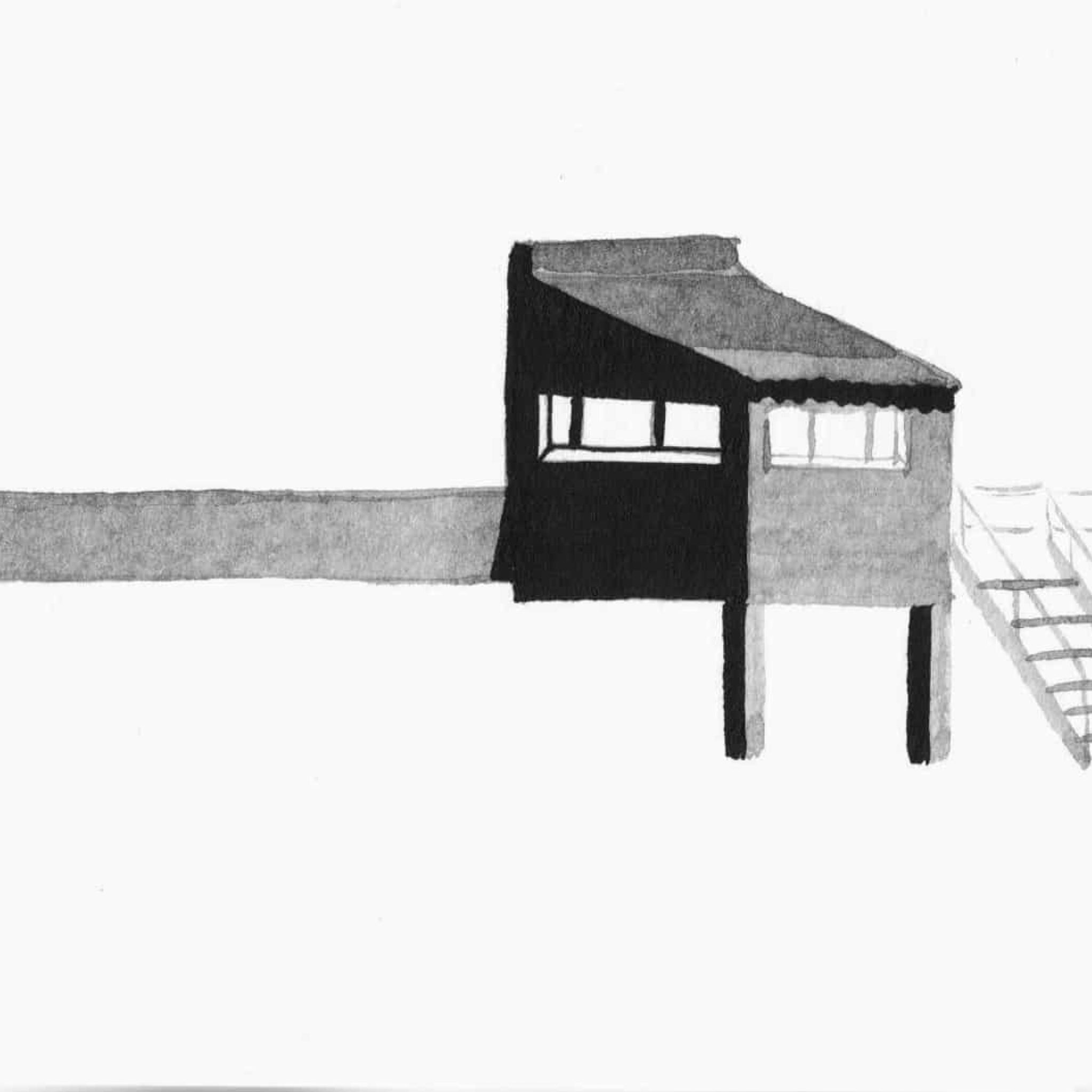
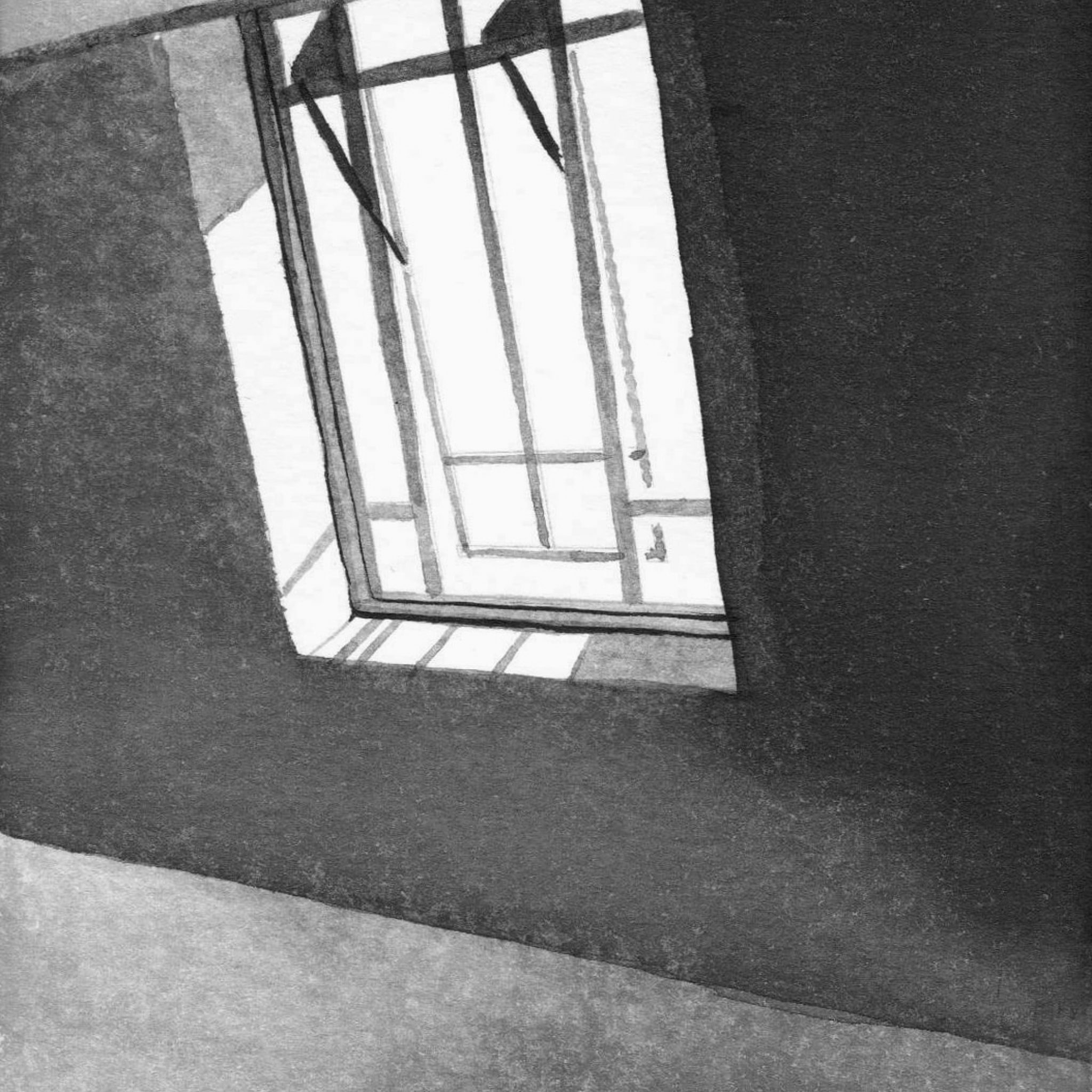
This series is called carnets de vacances or “Holiday Sketchbooks and it’s an ongoing series that I long kept for myself and only recently I added it to my website. It’s actually my mother who told me to do so because she considers it as my most beautiful work. I don’t agree with her and the sketchbooks never seemed to me to be material of any potential interest for anyone else. But, I realize now that they show another side of me since it is easily my most intimate work and it definitely helped to define and understand my identity.
These drawings are very simply executed with ink and water sometimes on spot but often at the end of the day from photos I took on a hike or a walk in a city or a small village, for example. I started them at a time when I felt a bit trapped in my drawings because I always fight between technicality and simplicity, which I consider to be the perfect balance to find to be a good artist. I needed something lighter, without any background research or any specific meanings or intention of a series. Just a representation of moments in time and glimpses I’d like to remember.
Ultimately that means that all these drawings represent something that is very dear to me. I’ve been living in Paris, France for the last five years, but never felt really comfortable here. I don’t especially enjoy the general energy or people’s everyday behavior. I find it too crowded and desperately lacking of greenness.
Being from the South of France I constantly miss the sun and the sea and the way of life, because this is who I am so I guess depicting all this—the summer sun at the end of the day, the breeze in the palm trees on a hot day by the pool, the feeling of waves swallowing your feet while you stand on the beach—it’s basically a way to remember it during the year.
Ink is the perfect medium to translate the strong contrast between sunlight and shadows, when they’re not softened or made invisible by the presence of too many buildings. Of course I realize this all sounds really melancholy, but beauty is everywhere which is why I drew an office or Parisian staircase or window in London. I just find it so important to take time to pause in our worlds sometimes. Especially since we constantly rush for everything and when we take a break we check our Instagram or something else, so I think it is vital to look around a bit more. Just capture the small things as they happen in front of us in real life.
I’d say, this is just a humble sketchbook with no specific agenda, but I’d be happy if it helps people to dream a bit.


