From Connoisseurs to Casuals
Well before the Green Rush and the flood of Silicon Valley-backed cannabis products hoping to target the new markets that would emerge, there were already brands working hard within the then legal grey zone to tap into the new lucrative market.
For one, Sherbinskis, a California-based flower company, was an early mover that would establish itself in the space as a purveyor of highly-curated craft bud produced out. The same went for Proper. That brand invested heavily in the experience of educating customers by testing and categorizing thousands of products and their effects using the data-driven approach of founder Mike France.
Since then, the market has diversified in terms of brands targeting different segments. From the highly discerning OGs who know exactly what they want in a high to casual or first-time users dipping their feet in new experiences, there’s a visual branding style to match their comfort level. The same can be said for whether a brand is targeting users taking cannabis for recreational or medicinal purposes.
Making Cannabis Products Approachable
Codo Design has given a detailed breakdown of some of the more recent visual branding trends that are prevalent in the market. Though nuanced, (almost) all of them are trying to make legal cannabis products more approachable for newcomers from different segments. We’ve arranged their (often accurate and hilarious) categories on a rough spectrum:

- Scientific: plain packaging that’s differentiated by color-coding or brown medicine bottles with clean white labels. Familiar packaging similar to the supplements you’d find in pharmacies and drug stores.
- Spa-Worthy: health and wellness aesthetic not far off from what you’d find in a day spa with calming visuals that might dip into limited palettes and minimalism.
- Consumer Packaged Good (CPG): makes the product appear like any sort of other modern, playful item you’d find in a supermarket up until you read the ingredients or notice the telltale leaf somewhere on the packaging.
- Name Brand: familiar, but for different reasons. Channels Willie, Snoop or Marley and their cultural appeal. Shout out to Trailer Park Boys.
- Crunchy & Granola: the first stop in branding styles that deliberately channel another period. Muted colors and kraft paper, recall the outdoorsy counterculture of the ’60s.
- Your Dad’s Weed: similarly, another accurate leaning into the nostalgia with lo-fi influences and bold straight-out-of-the-’70s typography.
- Tough Guys Only: where we start to channel a different kind of vintage and start projecting widespread weed usage back into the early 20th century. Think all the sharp logos and packaging you’d now associate with high-and-tight haircuts, beard cream, craft bourbon, and EDC bros but for cannabis.
- Small Batch & Artisan: “This is an heirloom Indica strain that was lovingly cultivated by our small group of blind farmers.” Enough said. No, wait. “This pipe was hand blown by an ancient coven of secretive Himalayan sculptors using a kiln from the 1500s.”
- Couture Cannabis: At the end of the spectrum of branding that defines the new normal is where cannabis has been elevated high off the streets and into the salons of the most unreachable socialites. Foil seals, packaging with printed hand illustrations give the product of an air of luxury.
- Shit Posting Made Manifest: Deliberately excluded from the spectrum, not only because it no longer fits visually, but because not many consumers want to associate with this “classic” style of loud, threatening graphics from the ‘90s. Although there are still brands working in this style, the appeal of “sketchy” hasn’t aged well.
- Tongue-in-Cheek: While not explicitly mentioned on Codo’s list, it’s worth mentioning that there is a style that cleverly and playfully riffs off of cannabis and its original stigma. With punny names or flat-out crazy concepts that could be gag gifts, they’re still aesthetically pleasing enough to not drive people away.
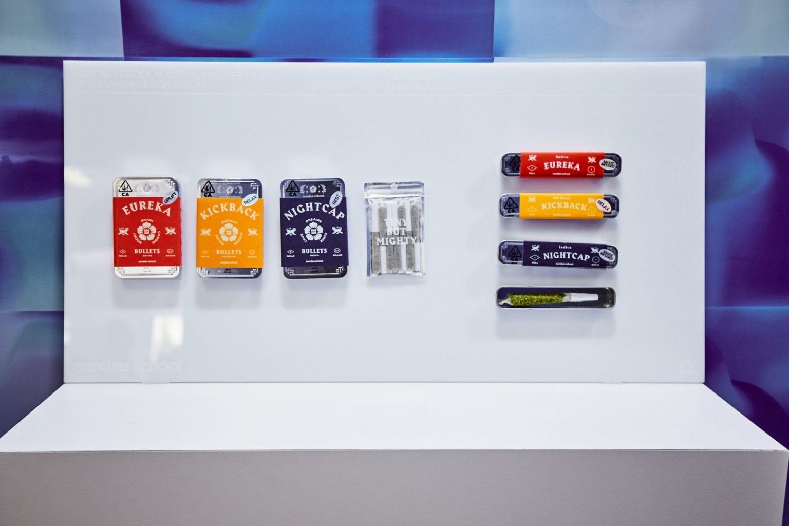
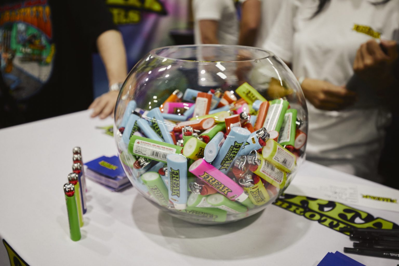
To see how some of these different products can play out visually, check out our story on Hall of Flowers, a trade show devoted to the cannabis industry and community (and where the photos in this Analysis are taken from).
The Takeaway
Call it “tried, tested and true,” on-trend or even laziness, much of the branding we see in cannabis products today is grafted from brand trends that were applied to other lifestyle segments like health and wellness, artisanal goods, and pure nostalgia. As the legal industry continues to develop and new markets become involved in shaping it, we’re interested to see what new forms of visual expression emerge as a result.


